Apagon App
A modern method to report power outages.
Apagon App is a crowdsourcing mobile app for reporting power outages.
Project Specs:
Duration: 5 years
Development Stage: In Production
Tools:
Adobe XD
UIKit, Swift UI
Jetpack Compose
Mobile Map (GIS)
Deliverables
App Store App
Google Play Store App
Roles
UX Research
UI Prototype
UI Design
Overview
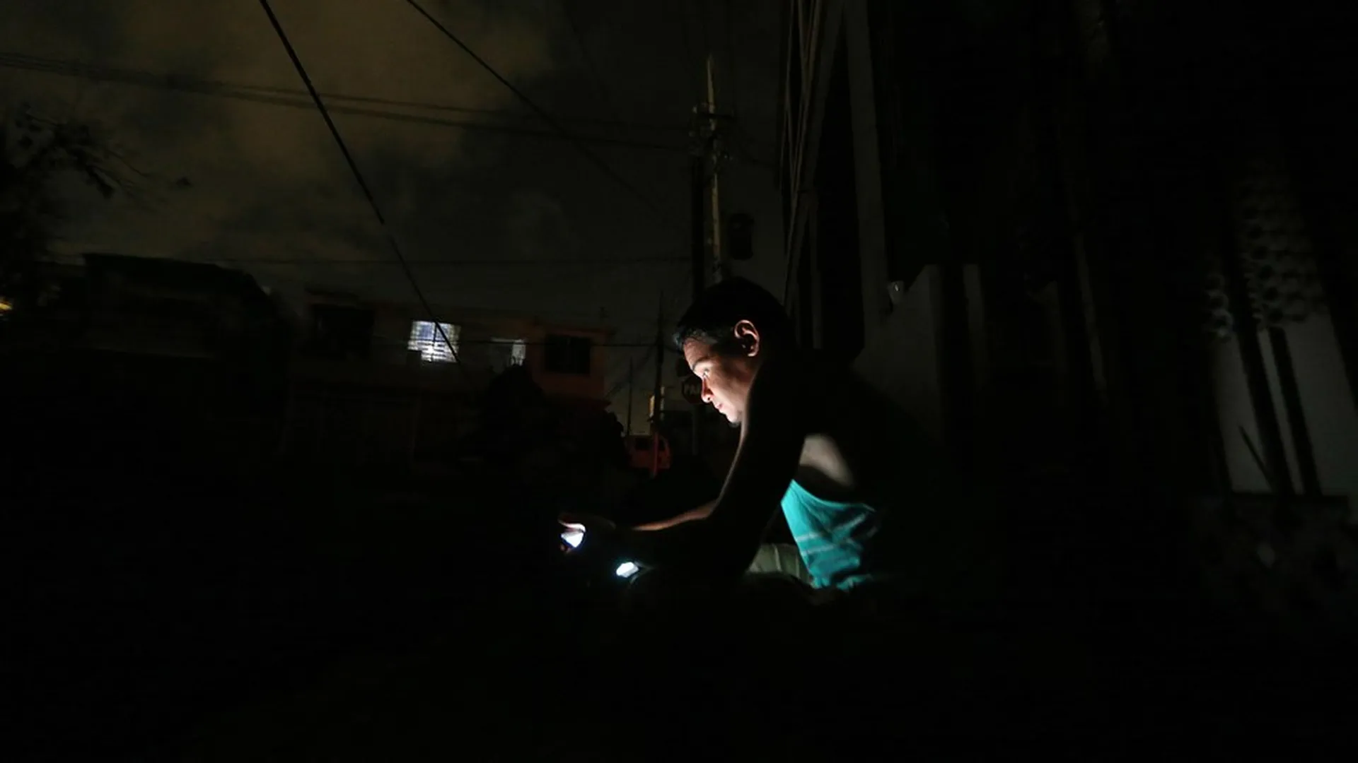
Apagon App users can report power outages quickly and effortlessly. The app was initially rapidly developed after Hurricane María landed in Puerto Rico as a response to the government's poor data infrastructure to document and track citizens’ power outages. The app's design is simple, aiming for quick action from users in distress. The app visualizes the crowdsource reports in a map to provide situational awareness to the community of users.
Apagon is operated by Apagon LLC, a non-profit I helped found. Apagon LLC is collaborating with academic institutions, researchers, and other non-profits to understand the impact of power outages in the health and energy sectors. I researched, prototype, designed, and help build the iOS and Android app. I actively contribute to the app's Android and iOS Front End development and use the tool to keep up-to-date with new mobile design frameworks.
Problems
Power utility companies often do not have real-time information about their clients during disaster recovery events. During a disaster event, most clients lose their energy source and internet. Hence they cannot report their power outage through web apps.
Utility companies have issues finding the location of a power outage during an emergency.
Most utilities use old GIS and web app technologies for users to report their power outage
Power utility maps do not have high-resolution zoom capabilities.
Solution
A simple app that allows users to report power outages.
A simple UI to report power outages.
Leverage smartphone GPS to identify the user’s location
Show the power status of users on a map with high resolution for situational awareness.
Research
Findings
Web app outage reporting methods use old web technology unsuitable for smartphones.
PREPA’s reporting method at the time was cumbersome and convoluted. It had room for improvement and simplification.
Our research for the Apagon App was done on the fly and as the emergency unfolded. Using a web app in a mobile browser for reporting power outages was problematic from a User Interface and User Experience perspective.
Reporting an outage using PREPA’s web app was painful.
Only clients with an account with PREPA could report power outages.
The User Experience allowed for user errors. PREPA’s form asked users to type their address and the sector of the outage manually. No Google Maps. No Autofill forms.
Apagon LLC’s team was inspired by the simplicity of the toggle…
… and the efficiency of car-hailing apps.
Modern car-hailing apps made maps intuitive to understand to the user.
Design
Apagon was designed over sprints to stand up the app rapidly. I developed the app from that starting point—the app started by reporting power outages and a lack of water service. But as the months passed and the energy emergency became more apparent, the app’s design evolved to solve only the problem of reporting power outages. Instead of doing paper wire frames, I jumped straight into mid-resolution.
Version 1
Early versions of the app were designed to provoke a conversation with the larger volunteer software developer community that emerged out of Hurricane Maria. These early designs capture the core transaction of the app—a simple UI to report energy status and a map to display the status.
The original app had a simple form for users to fill out and give us their location. Then it had a simple call to action. Users could report whether they had power and energy.
After hearing user feedback on the street and from software developers, I simplified the design to leverage the smartphone’s GPS. I reduced the form to simply asking for the user’s phone number.
Version 2
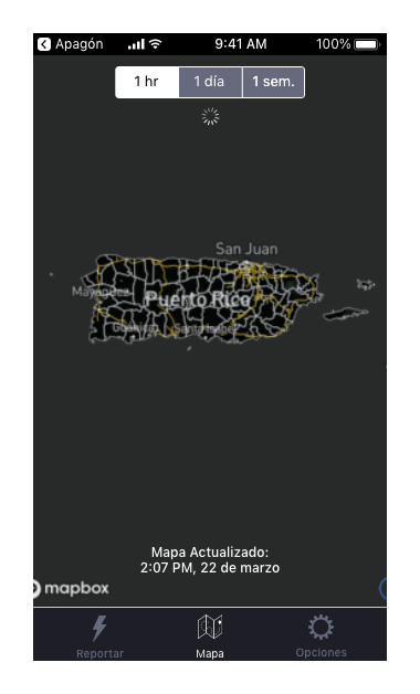
After testing the app mockup with users and recruiting a team of volunteer developers, we decided to simplify the app and concentrate on only power outages. The app had to resolve some interaction problems related to the temporal nature of time-series data. I introduced the concept of a segment controller to allow users to filter reports depending on the date and time. This feature lowered the need to stand up a robust back end to handle traffic when the app loaded.
This version of the app had to consider the interaction between different parts of the app. Simplifying the app’s UI help reduce complicated interactions and flows between tabs and views.
I also created the first color scheme and components for the developers to use as assets.
Apagon Version 2 as designed and published on the App Store and Google Play Store
Version 3
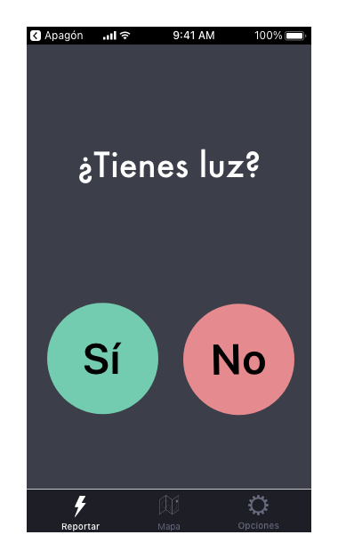
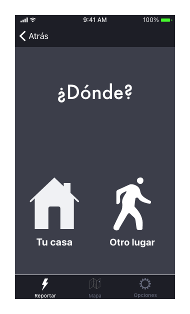
After launching the app and getting around 400 users, we decided to redesign the app to have more neutral pastel colors. Impressionist pastels inspired me for the colors. I styled the app's map to match the new pastel color scheme.
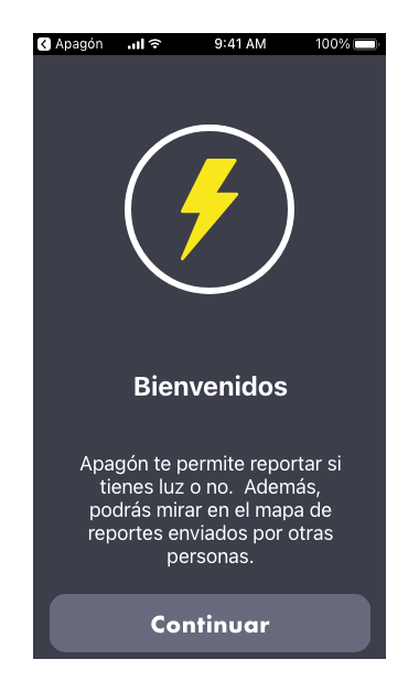
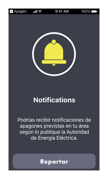
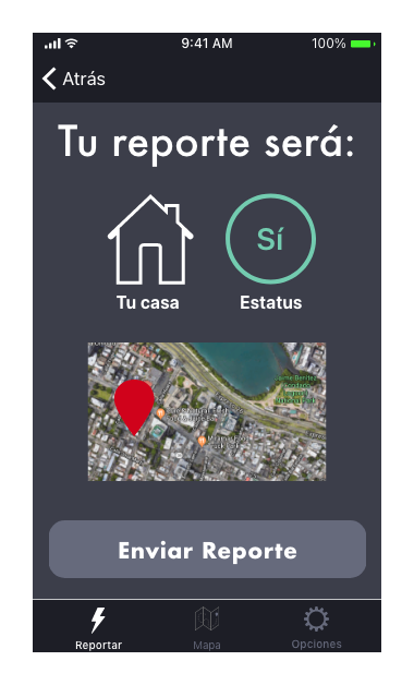
I also added an on-boarding experience for users that had trouble navigating the UI for the first time. We switched the default tab to the reporting tab instead of the map to encourage people to report. Finally, we added a confirmation view for situational awareness before the user sent the report.
The new color palette for Apagon’s app, he color palette was inspired by impressionist pastels.

Version 4 - In Production
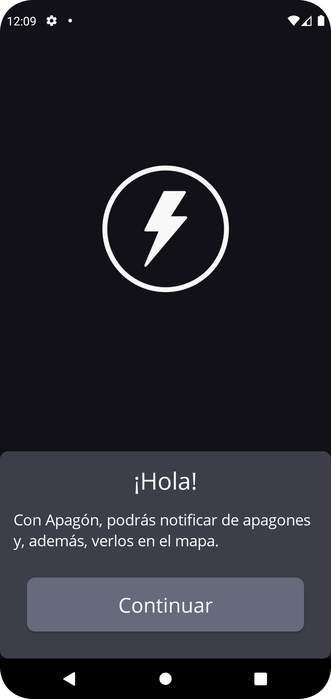
Apagon operated for several years using version 3 with no updates. Recently the team decided we needed to update the design framework used to deploy the app. We wanted to move the code to SwiftUI and Jetpack Compose. These modern design frameworks reduce the amount of time debugging User Interface problems. They also allow for new features to be rapidly developed. One of the main changes we wanted to make was to support Light and Dark modes. Both frameworks allowed us to change the Front End of the app without creating too much code to allow for these modalities.
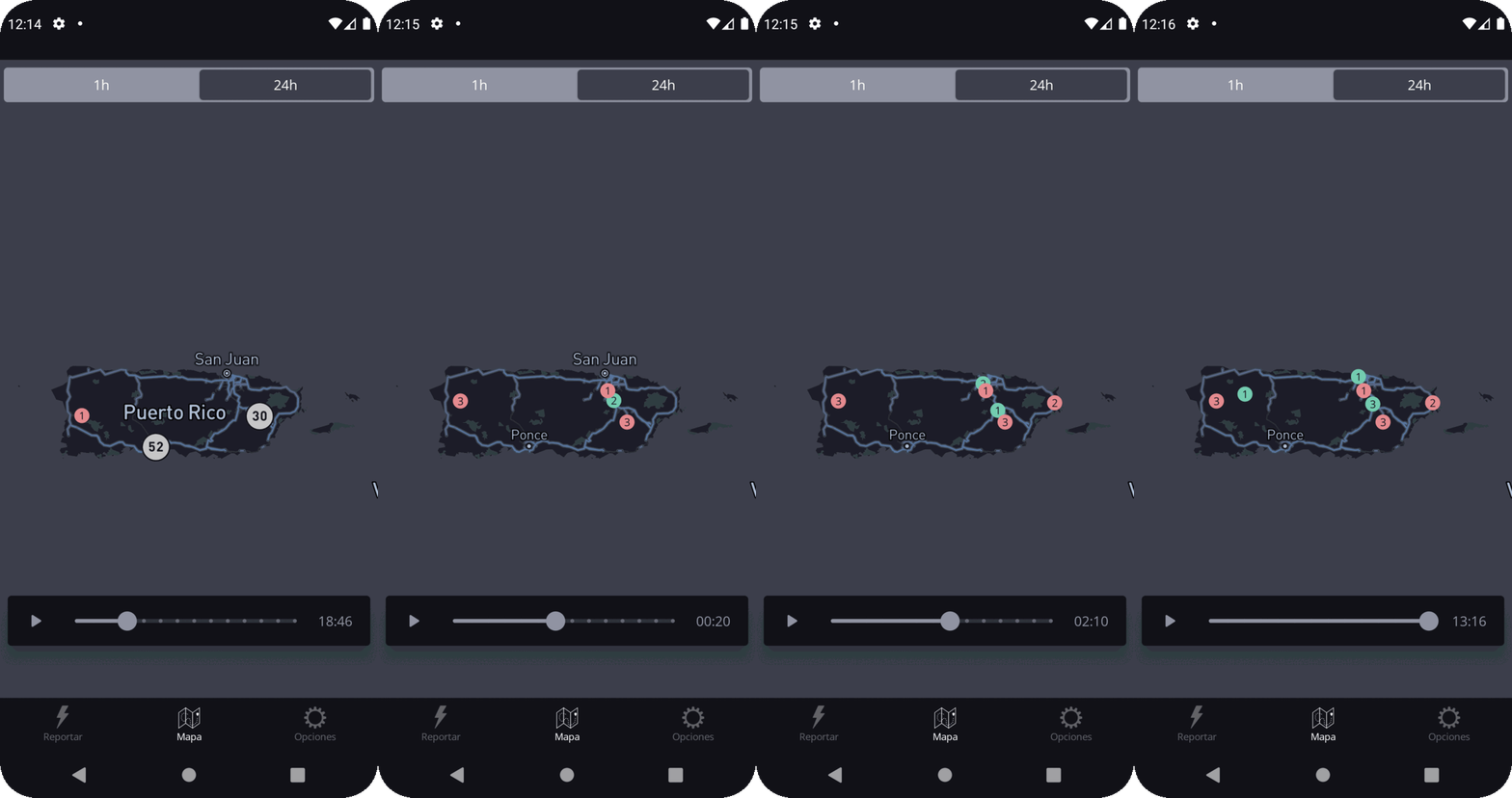
With the transition to SwiftUI and JetpackCompose, we decided we could simplify the app even more. We reduced reporting a power outage to one step, where the app shows the user their current location and power status. For the map, we replaced the segment controller with a slider that animates the reports as a time series on a map.
Moving to new design frameworks in iOS and Android allowed me to quickly stand up the app's Dark and Light mode versions.
SwiftUI and Jetpack Compose cost to standup a view is so cheap they allow me as a designer and developer to move fast and concentrate on design. The new framework also allowed us to deploy a better onboarding experience. I used Components and SwiftUI Views to onboard users when using the feature for the first time.
Sometimes simplifying features brings new complexities to projects. I designed a new filtering method that allowed for the animation of reports on the map. While the slider was easy to implement from a UI perspective, it posed several challenges to the back end.
We also simplified the reporting steps when we transitioned the code base. Users can now report in 2-steps.
Summary
Apagón App is a crowdsourcing app developed rapidly after Hurricane Maria. The app was launched as an early prototype and has undergone UI upgrades as users started using the app and started providing feedback. The app is currently in production.
Lessons
In a disaster, it is better to launch an app that is not fully designed rather than wait for the perfect design.
Iteration over time allows the design to be improved based on user needs. It also provides for simplification.
Modern design frameworks are remarkable for rethinking your original app. Not only do they allow for the app’s UI to be coded rather than layout, but they also allow for new features to be rapidly developed.


