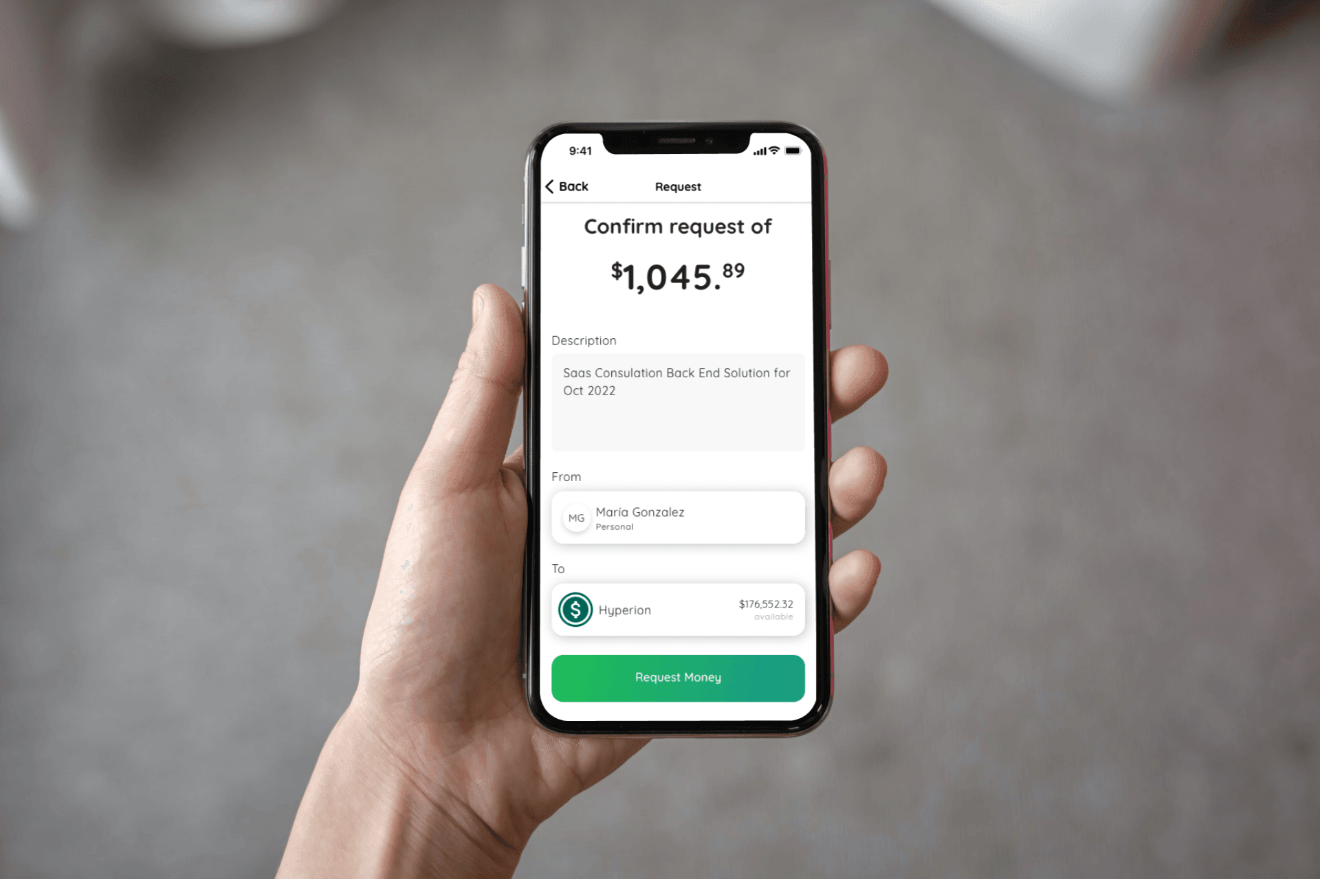
Hyperion App
Financial Services for Small and Medium Size Businesses
Hyperion Finance, Inc. hired me as a Senior Product Designer to redesign their financial services app built around dual money transmitter rails. The app uses a combination of decentralized finance (DeFi) and the traditional banking network to help start their businesses and charge customers. The app will launch in mid-2023.
Project Specs:
Duration: 5 months
Development Stage: In Development (planned released)
Tools:
Pen and Pencil
Adobe XD, Figma
Deliverables
Competitive analysis
Low-fidelity wireframes
High-fidelity mockups and prototypes
Design System
Usability tests and findings
Roles
UX Research
UI Prototype
UI Design
Front End Tech Stack Advisor
Overview
Hyperion Finance, a fintech startup launched to help small and medium-sized businesses, is building a money service solution to help entrepreneurs launch and operate their businesses. The app targets the market of small businesses in Puerto Rico that use ATH Movil as their primary tool to charge customers. The Hyperion app was developed to address this gap in this niche market.
Problem
ATH Movil was built as a peer-to-peer payment exchange app. Small and Medium Business owners use ATH Movil as the platform to transact with customers. ATH Movil lacked many of the features businesses would like to operate and manage their business.
The company had two main challenges:
1. Create a seamless, trustworthy experience that could win new and old business owners over to download and use the app
2. New business owners had the challenge of registering their business with the IRS, the local State Department, and Hacienda.
Solution
I redesigned the app to minimize steps on complicated flows and forms. I aimed to align the app with peer design practices and reduce the aesthetic of crypto. Gaining the trust of users through design was my priority.
Keeping the app simple and minimal helps us remove unnecessary features from the MVP that beta users who had signed up to use.
Solutions to challenges:
1. Redesign the app to align with market comparable that provide similar services.
2. Streamline the app and provide a transparent and straightforward experience for on boarding and transacting payments.
Research - Competitive Analysis
Findings
Brand recognition and ease of use of the app are vital.
Inconsistent app behavior can lead to the erosion of trust from a user.
I identified PayPal Business design and marketing as an industry best practice for what we were building.
I did a competitive analysis of ATH Movil. The investigation revealed immediate brand recognition from most beta users who signed up to use the Hyperion app. Most reported positively for the simple, ease of use of the app when it came to making payments
Customer reviews for ATH exposed user frustration with buggy software and inconsistent user experience with the app.
While customers in Puerto Rico did not have access to Pay Pal Business due to regulatory reasons, we used it as a gold standard for what users that operate a business expect from a financial services app.
ATH Móvil
Hyperion Beta users who had signed up to test the app expressed positive and negative feelings towards the default app used in Puerto Rico for digital transactions.
ATH Móvil has a simple and clean interphase that is intuitive to use…
ATH Móvil UX
…but the app is often buggy and crashes. These experiences erode user confidence in the app over the long haul. Hyperion Beta Users expressed concern over transacting over an unreliable app that was meant for peer-to-peer money exchange
ATH Móvil Ratings
The inconsistent User Experience is reflected in the low rating ATH Móvil has on the App Store and Play Store.
PayPal Business
Pay Pal Business solution served as the north star for developing our app.
Hyperion‘s Position
Hyperion needed to reposition its product within this two examples.
Research - Crypto Brands
Findings
DeFi’s childish, cartoonist, and colorful branding and user experience did not align with Hyperion’s challenge of gaining the trust of business owners.
Hyperion needed to aim for institutional online banking branding.
Before joining Hyperion, my familiarity with crypto was limited. I had taken an MIT class on it and experimented with buying some crypto and executing some small transactions. I found the whole experience quite traumatic. Nothing was streamlined, and most user experiences did not reinforce trust. Nevertheless, I committed myself to understand the technology from a branding and user experience perspective. Hyperion was building a solution on the DeFi rail, and I needed to understand the space from a design perspective.
I delivered a memo to Hyperion establishing my findings from a survey of the websites and app solutions on the market. My main concern was that most companies in the DeFi space had either cartoonish or childish branding that needed to align with gaining and retaining business owners. As a business owner, when you are transacting thousands of dollars a day, the last thing you want is to feel like your hard earn money is being handled by kids.
My main takeaway from the exercise was that the app needed to align with more institutional brands in the online banking space, like Capital One, and maintain a serious and neutral tone.
Ethereum Brand
The Ethereum Blockchain is one of the biggest in the market. Ethereum’s marketing invokes the 1970s Jean Giraud illustration and the use of muted pastel colors.
Circle’s Palette
Circle, the non-profit organization behind the USD Coin, a cryptocurrency that claims parity with the US Dollar, uses sans-serif fonts and color gradients. Circle’s tone strikes as serious with their font but playful with their use of colors.
USDC Branding
Many DeFi crypto stakeholders and solutions providers lean heavily on using 3D rendered images with gradient palettes.
These colors and imagery look futuristic and might help gain new personal accounts, but for business owners, it might signal the need for seriousness and maturity.
Research - User Survey
Findings
Users expressed frustration with the UX offered digitally by local banking solutions.
Most business owners wanted to be able to pay a provider or charge a customer with less friction.
Users enjoyed a mobile-first experience.
Users wanted to query bank statement history older than 90 days.
The founders at Hyperion had already conducted a user survey that I used to understand the users' needs better.
The number one pain point Users expressed was the lousy design local banks had to offer as commercial banking. Executing a payment on their platforms was not intuitive, and accepting digital payments required extra setup and fees. The survey also revealed that owners wanted to query bank statements older than 90 days, and all local banks charged users a fee to retrieve that information.
Digital Banking
Beta users expected their commercial banking experience via a web app or a mobile to be the same as their personal banking.
Payments
Hyperion Beta users wanted a modern payment experience where they could charge customers digitally for any good and pay providers instantly for any service.
Design
Joining a company that already has developed a product design is complicated. The previous research helped me understand the product Hyperion was creating, but I was not going to start from scratch. The founders already had a design in their minds that was being coded. I collaborated with the development team to develop new design solutions for the existing version. Establishing versions was crucial to organizing the design development. Hyperion had also hired sub-contractors to develop the redesign of the app. As a Senior Product Designer, I had to design and manage a remote team and collaborate closely with the development team to ensure we used our time effectively.
The design by the Founders
The founders had already developed a design for the app that was in the process of development when I arrived. I focused on discovering design intent, understanding design decisions, and communicating to the founders what I thought would work for future app versions.
Discover intent.
My main priority was understanding the design intent behind the founder’s app design.
The founder’s design of the app was driven by the following:
Regulatory requirements established by the OCIF (the US Federal Regulator in PR)
Technical Requirements to Implement Decentralized Finance Solutions
Founder’s idea of design best practices
This approach allowed me to gradually introduce ideas and designs and avoid disrupting the development team's work. It also allowed me to present solutions that shared a common vision for the app’s features when the existing design did not work.
Understand Design Decisions
The color palette selected followed Google’s Material Design standard. The founders were aware of the need to comply with minimum design requirements for the app’s approval in the Play Store and App Store:
Contrasting text color
Text legibility
Color blindness legibility
The founders' picked a serif font style that was playful and legible. They used Google Fonts and Material Design standards to establish the font hierarchy for the app.
The founder’s design components for cars, spacing, tabs, buttons, etc. were also taken from the Material Design Library.
Keep the successful designs.
After aligning with their design intent, I decided to communicate what I thought was successful about the design and its shortcomings to the founders; this helped me stage any design changes for future versions.
Success:
Color Palettes
Use of Material Design as a guide
Color Palette and Font Selection
Basic Design Components
Improvements:
Align with the newer versions of Material Design and Apple’s Design System
Organization of app tabs and views
Improve hierarchy for views, data presentation, buttons, and components.
Align components to Hyperion’s design problem.
Feature Sketch
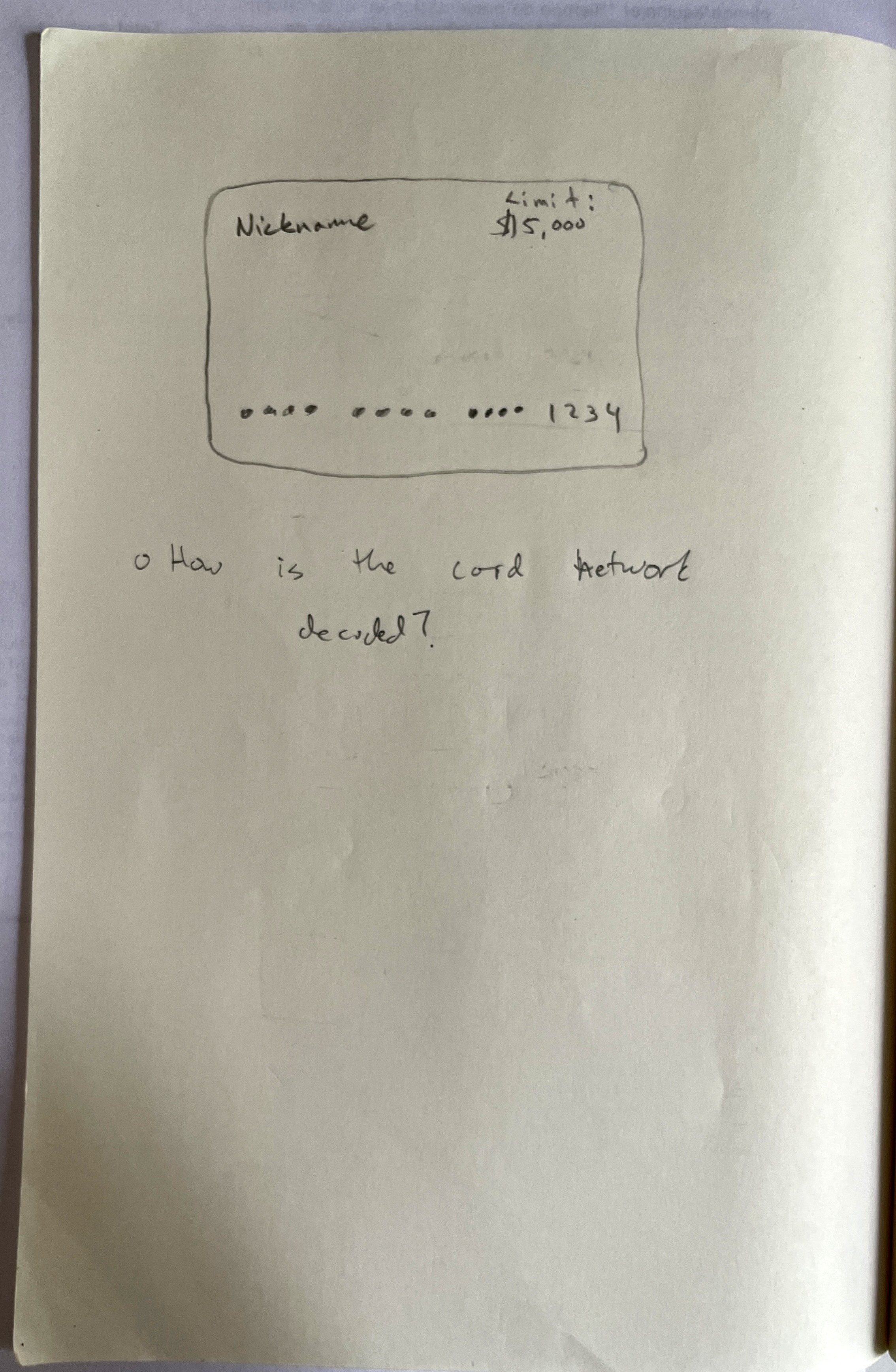
One of the first practical tasks I was given to solve was to improve how the App dealt with Virtual Cards. Rather than jump directly into the Figma Design file, I did manual sketches; this helped me focus on communicating the basic idea without having to deal with all the changes I had in my mind for a future version of the App.
While sketching the solution for how the App would issue virtual cards, I confirmed that one of the main challenges of the App was establishing a clear hierarchy based on the user’s primary core transaction needs.


Mid-Resolution Mockup
Hyperion hired the design agency UInk to redesign their app before I joined the team. I was tasked with overseeing the redesign efforts, establishing a common design framework and the direction Hyperion should go from the research I conducted above. UInk had already drawn the same conclusions independent of my observations. It made delegating the “brain work” to redesign the app much more manageable. I mainly supervised, requested design revisions, and approved the mid-resolution mockups.
We used an Agile method for design development. As UInk developed features were marked completed, I started designing the high-resolution mockups, allowing my designs to run in parallel with UInk efforts. We could plan what part to redesign next much faster. It also allowed the development team to implement the design changes in quicker, smaller sprints.
Redesign of the Hyperion App. Source: UInk.
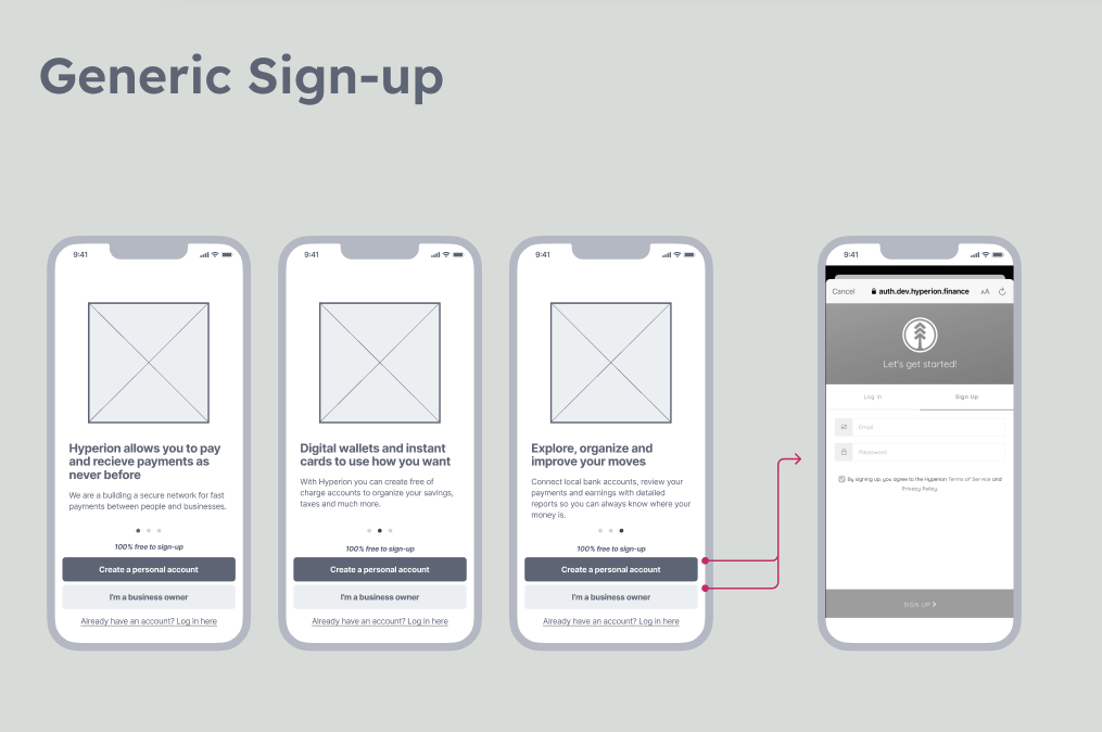
Redesign of the Login flow. Source: UInk.
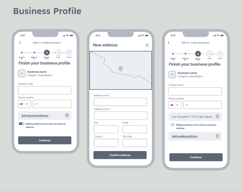
Redesign of “Know Your Business” Form. Source: UInk.
Redesign of “Know Your Business” Form - Profile Info. Source: UInk.
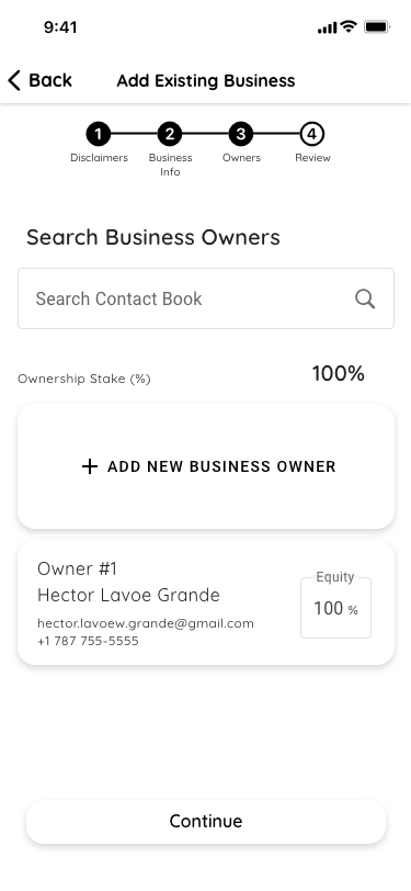
Redesign of “Know Your Business” Form - Business Owners. Source: UInk.
Redesign of “Know Your Business” Form Review View. Source: UInk.
Home View and Receipt View. Source: UInk.
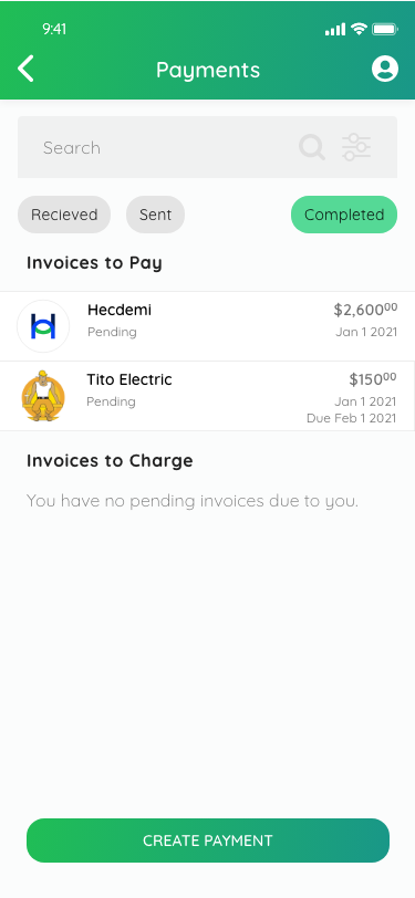
Overview of Payment, Sending and Transfer View. Source: UInk.
Detail View of the Tab Button with transaction options. Source: UInk.
Send Payment Flow. Source: UInk.
Request Payment Flow. Source: UInk.
Transfer funds from Wallet to Wallet Flow. Source: UInk.
Invite New Users Flow. Source: UInk.
Wallet and Wallet Details. Source: UInk.
Virtual Card View. Source: UInk.
Design Refinements
Before jumping into the high resolution mock up, I decided Hyperion needed to further develop its design components and adopt a more intentional design system. I develop a more muted color pallete and design new components that help reorganize the app.
A simpler color palette for the app to inspire trust.
Hierarchy in the use of buttons. Only use color to signify a significant event.
Redesign the tab bar to follow Material Design and Apple Design guidelines. I reorganized the value add features using the concept of cards.
A symbol system helps users visually resonate with app actions or states.
Cards also played a role in communicating complex information. The most apparent use for cards is depicting virtual debit cards, but I used different proportions and symbols to expand its service to denote account states, account info, and call-to-actions.
Design Evolution
Before presenting the high-resolution mock-ups. I want to show how the app evolved over a short period. This evolution shows how alignment with the founders’ vision, my experience as a designer, and the work done by UInk as consultants all came together to build a financial services experience.
One crucial element in coming up with the final high-resolution design was considering the reuse of existing codable components from the Material UI - React JS Library. We were not trying to reinvent the wheel. We only built custom UI like the virtual debit card and the user’s info card that we could not find off-the-shelve in Material UI. Another important reason to reuse libraries like Material UI in implementing the high-resolution design is that users already have built-in usage patterns and expect consistency in UX that is familiar to them.
The founders’ Design of the Home Tab.
UInk’s Home Tab Redesign.
Final Home Redesign.
The founders’ Login View
UInk’s Login View.
Final Login View.
Undefined KYB/KYC Forms from founders’ design.
UInk’s Sample KYB/KYC form.
Final KYB/KYC form.
The founders’ initiate transaction view.
The founders’ Payment Submission View
UInk’s main transaction button sheet view.
Final Sheet View.
UInk’s Payment Submission View
Final Payment Submission View
High Resolution Mockup
After several sprints, I managed to stand up the whole High-Resolution app version. In total, it took about two weeks to refine the design. After presenting the app to the founders and the development team and answering any design-development questions, the app was ready for user testing.
Usability Testing
Once we finished the high-resolution mockup, we conducted usability tests. We created an Excel spreadsheet documenting each of the district steps users had to take to complete a given task. We tested the app using Zoom, giving users remote control to have the freedom to interact with the high-resolution mockup. We observed our subjects and documented how each user could complete all the assigned tasks.
Our tests helped us spot high friction points in the app, especially in the “Know Your Customer” and “Know Your Business” Forms. We refined the design based on these observations.
Method:
Select a sub-sample from Hyperion’s Beta User pool
Ask them to complete a given task
Observe how they completed the task.
Confirm that it matches the assumed steps in our internal document.


Test Version. Users had problems finding the button or call to action to add a new owner.
I added a large button to the owner list view to make it easy to spot. I placed it at the top of the list so that it is always viewed in case multiple owners exist.
Users needed help finding how to enter the amount for a transaction. There was no visual reinforcement for the task..
I modified the view to include some text to provide visual reinforcement. I also switched the default status of the view to have the keyboard show when the view loads.
Users intuitively went to the Wallet Detail view to add funds to the Wallet but were frustrated when they found they could not perform the action inside a Wallet view.
I added a button to add funds on the view based on observed user behavior.
Pre-Production Demo
Here is a preview of how all the design elements and decisions come together as an app.
Summary
My work with Hyperion was the first time I worked with a team with a design in mind; it was the first time I did not design something from scratch since I left Esri. The experience of collaborating with a team of talented programmers and designers reminded the importance of having a solid design methodology. Having a common design framework helps teams develop faster and with clarity.
Lessons
Discovering the founder’s design intent was crucial for team communication and design revisions.
Establishing a design vocabulary and framework helped solve UI and UX problems in a structured mannered.
Delegating design tasks, like developing the mid-resolution mockups, showed me the power of sharing design frameworks and values. It also helped the team achieve a complete mockup design faster.
New technologies require patient observation for designers to understand how to frame the experience around them. As technology evolves, the design will grow too; the key is to stick to the core values the product will provide the consumer.


