PREPA App
Reimagining mobile customer service
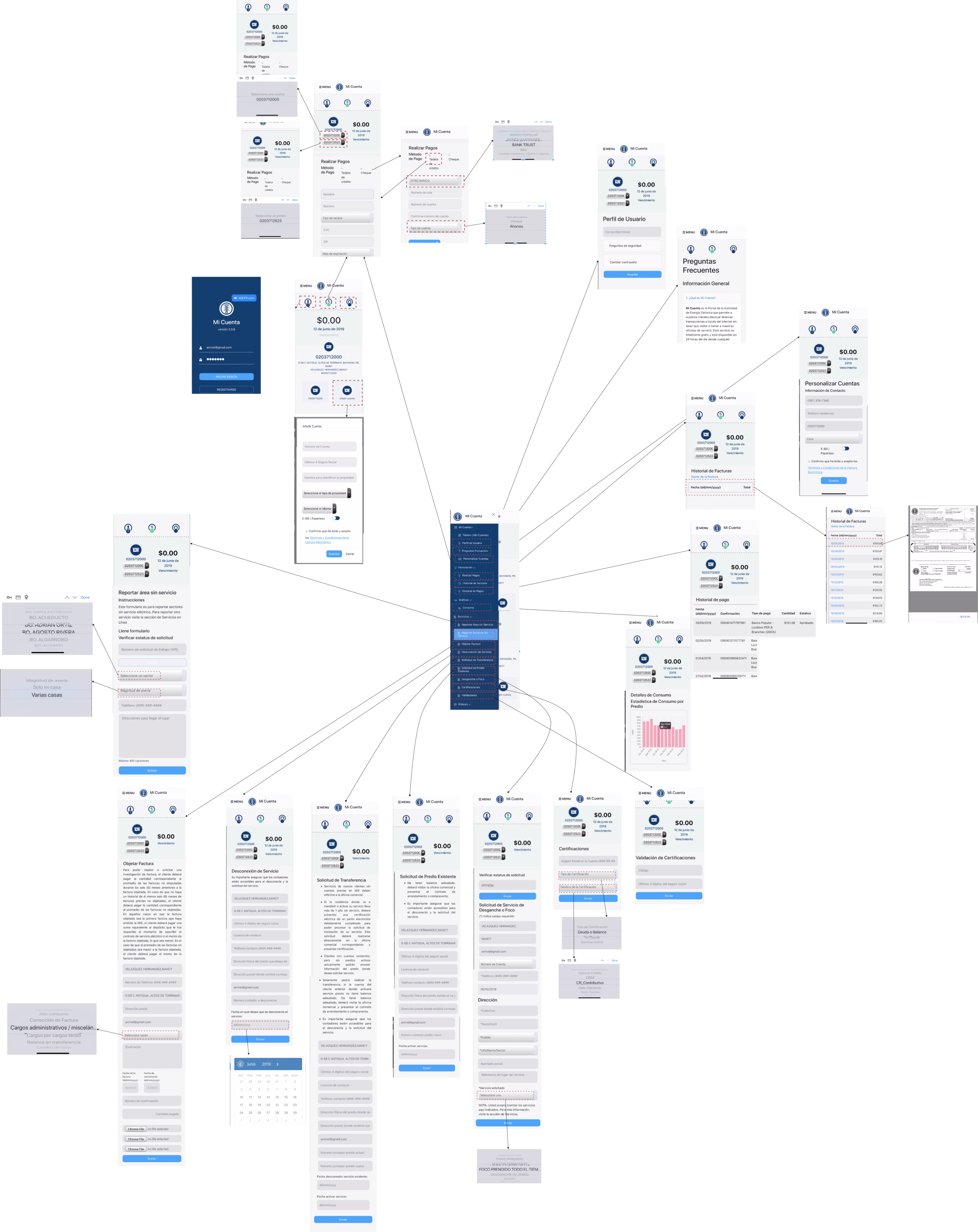
PREPA, one of the largest power utilities in the territorial United States, requested my company Qualtics LLC to build a customer service app that could support all of the services they offered in their web app. I researched, prototyped, designed, and help build the native mobile app along with my co-founders.
Project Specs:
Duration: 1.5 years
Development Stage: In Production (never released)
Tools:
Pen and Pencil
Adobe XD
XCode Interface builder, Jetpack Compose
Deliverables
Competitive analysis
User surveys and one-on-one interviews
Site map
Low-fidelity wireframes
High-fidelity mockups and prototypes
Design system and UI kit
Usability tests and findings
Roles
UX Research
UI Prototype
UI Design
Illustration
Swift Code Implementation
Overview
PREPA, one of the largest power utilities in the territorial United States, requested my company Qualtics LLC to build a customer service app that could support all of the services they offered in their web app. I researched, prototype, designed, and help build the native mobile app along with my co-founders.
Problems
Building a multi service, native app for a big company can be overwhelming and complicated. Specially if the company has a bad reputation for customer service, which was precisely the situation for PREPA, specially in the aftermath of Hurricane Maria.
We had two challenges:
1. We needed to understand how we could leverage the existing IT infrastructure to create the services needed for the mobile app.
2. We needed to design a world-class user experience for a company known for bad customer service.
Solution
The first challenge was addressed by mapping how the existing IT services would be implemented in a mobile app. The second challenge was addressed by doing multiple design iterations, and testing with a wide range of user, to arrive at the final design.
Solutions to challenges:
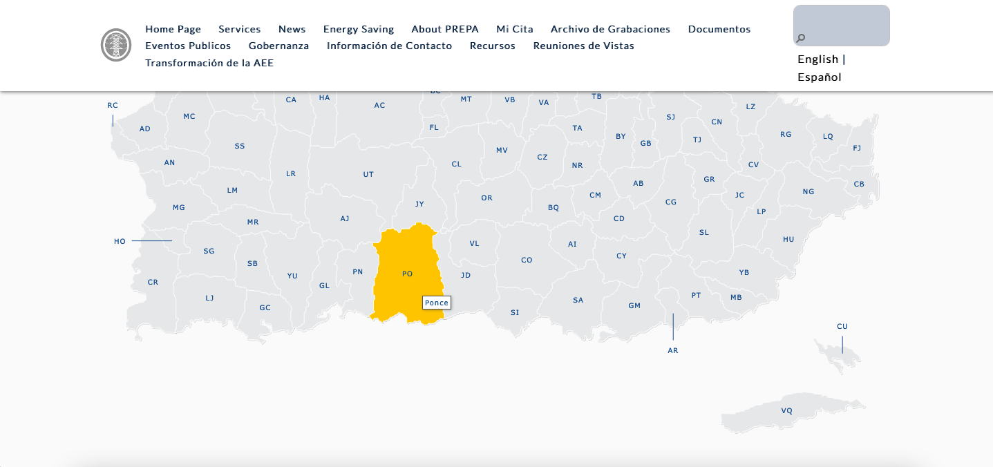
1. Create a web map and document the back end’s API
2. Conduct competitive analysis of other utility apps, investigate current user experience for PREPA users, and design an app that addressed PREPA user’s pain points.
Research - Competitive Analysis
Findings from App Reviews:
Users expected a modern payment.
Users want utility apps to save their payment method.
Users wanted a 3-click, seamless experience when paying their bills.
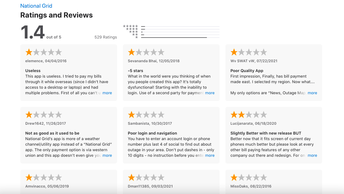
I did a competitive analysis of other apps developed by power utility companies. What this analysis revealed was that most power utility customers experienced friction paying their bills.
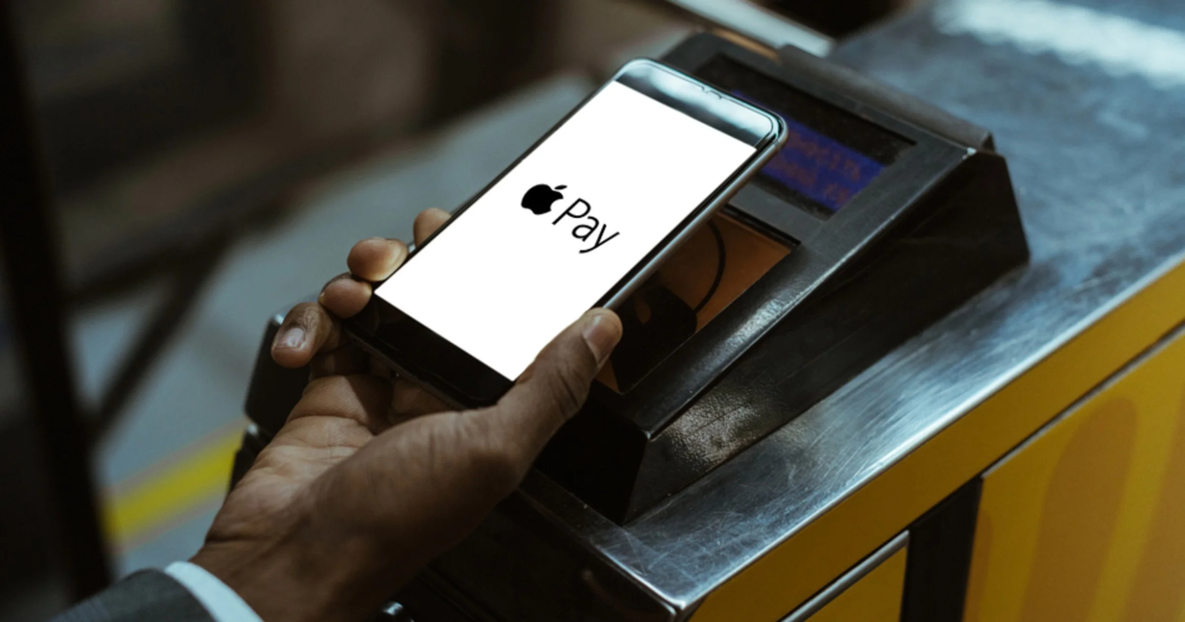
Customer reviews of the apps were clear: users expected a modern payment experience akin to Amazon or Apple Pay.
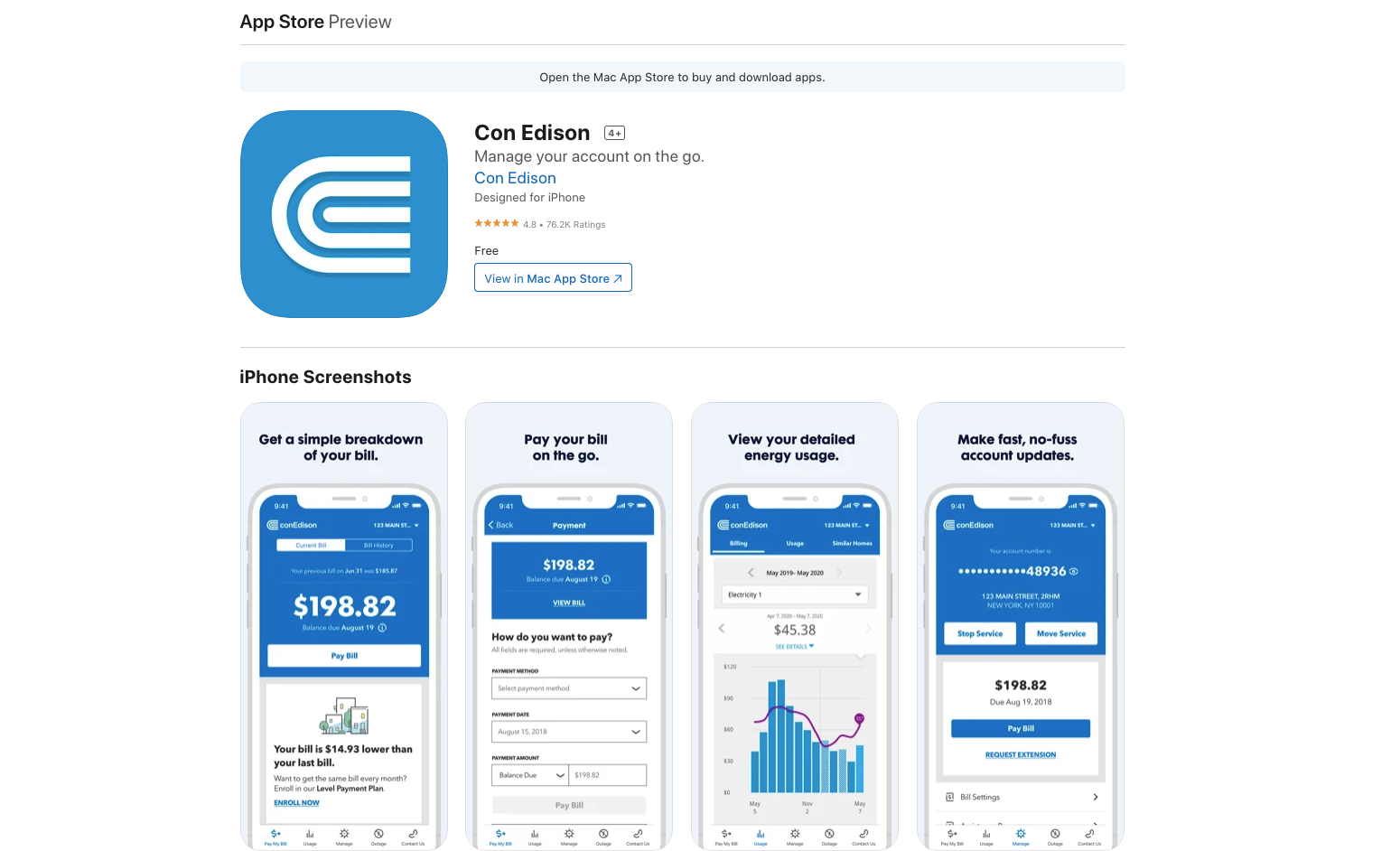
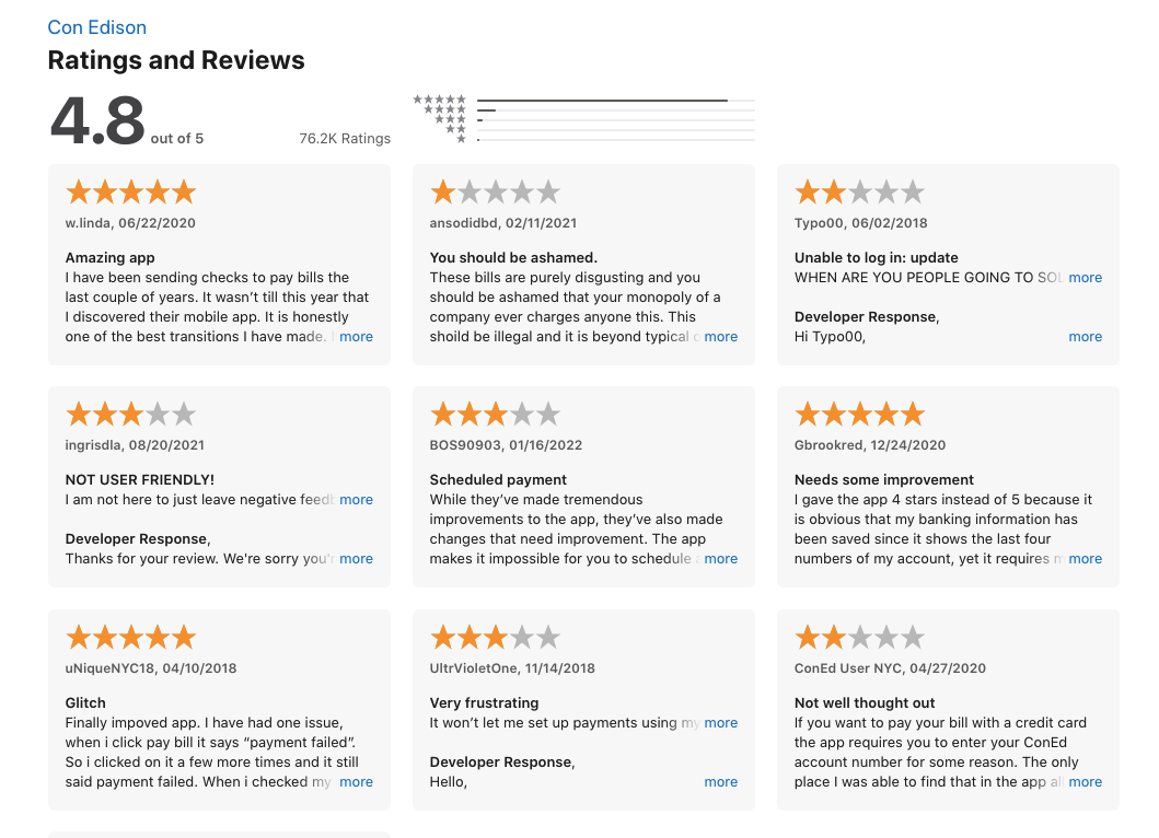
I also discovered that customer’s seemed to review positively ConEdison’s app. I analyzed the app and documented where the app was successful. Although PREPA has a monopoly over it’s services, this type of research helped PREPA and Qualtics understand a user’s expectation for a modern utility app.
National Grid’s App
The worst rated utility app in the iOS App Store
National Grid’s app revealed massive frustration with payment friction.
Con Edison’s 5-stars review became a guideline
Users positively reviewed the app for its ergonomic design and its easy payment flow. Users also praised the app for its use of graphics and clear organization of information.
User feedback guided our design and expectations from users
Research - Client Needs
Findings from Client:
Making payment flow easier for the user was the main priority.
Reducing user input errors on the service request forms.
Removing extra steps my taking advantage of unique smartphone features like geolocation
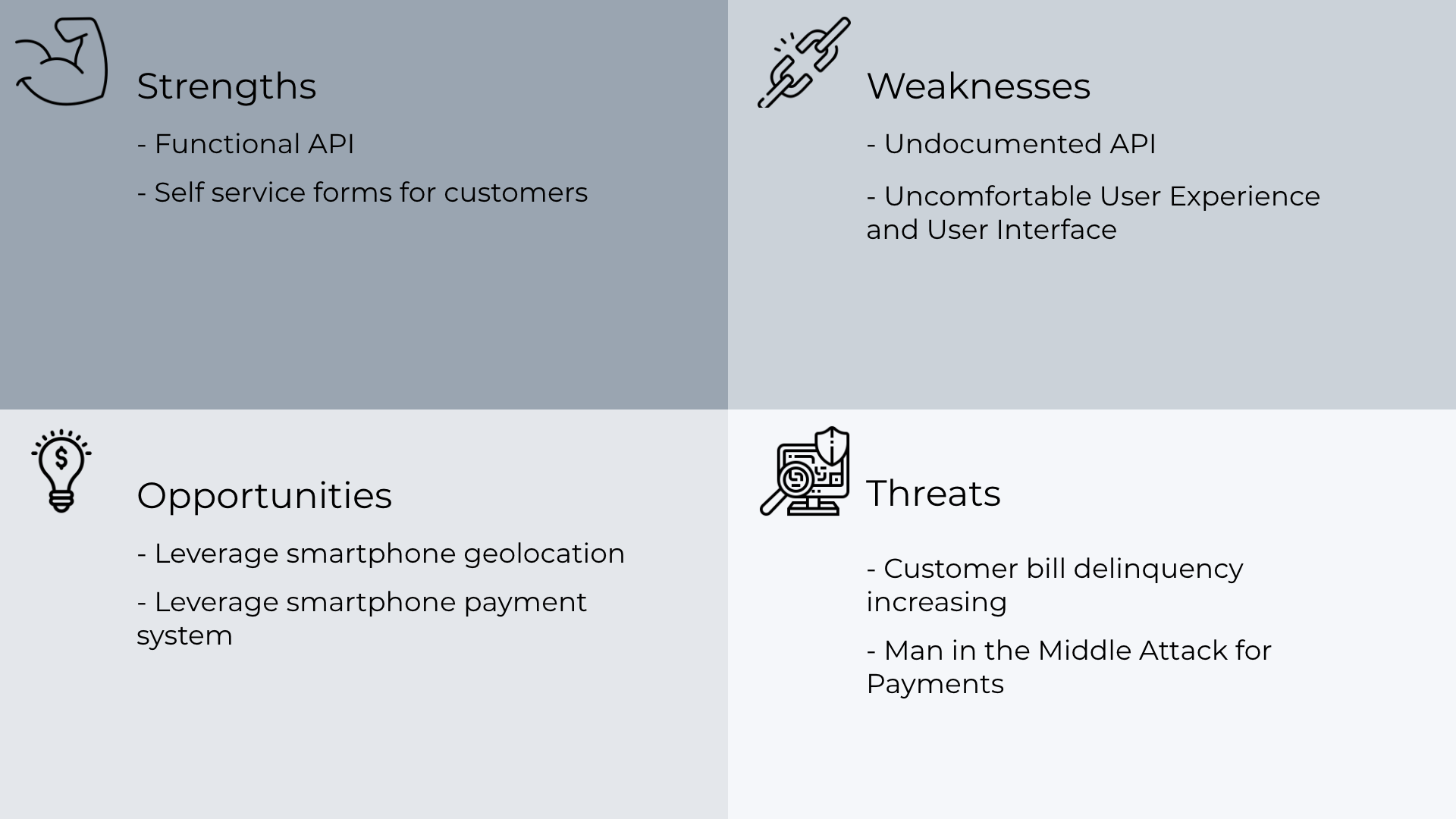
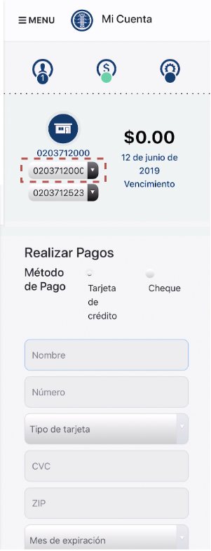
I helped my development team structure our project to better understand what where SWOTs for the existing services that PREPA offered through their web app. PREPA biggest weakness was its payment experience and they knew this. PREPA wanted to remove friction from the payment processing flow in order to increase customer payment success. This was their main priority.
Further research exposed another weakness. PREPA’s web app forms for requesting services where not ergonomic and led to user mistakes when inputting information. I, along with my co-founders, helped PREPA identify the opportunities of using a smartphone’s form components to help minimize those error. We also identified a smartphones’ location technology as method to minimize location input.
SWOT
PREPA’s existing user flow of their webapp on a mobile browser.
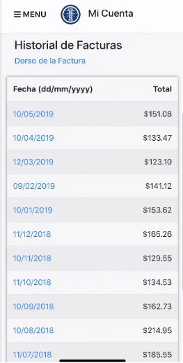
UI view of utility bills
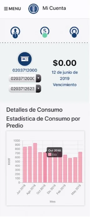
UI view of consumption
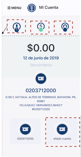
PREPA’s Mobile Web App - Accounts (Home)
PREPA’s Mobile Web App - Payment
Research - User Needs
Findings from PREPA users:
Making payment easier by saving preferred payment method
Easily report power outage.
View what regions have no power in a map.
Visualize monthly bills in a readable format
We developed five user personas and user stories for PREPA: the Boomer, the Grandmother, the Millennial, the Small Business Owner, and the Expat. We confirmed with PREPA that these personas reflected their user based by doing a statistical analysis of their client base.
With the personas confirmed, we interviewed around 13 current PREPA users that reflected a sample of those personas to better understand their pain points. Users had a general satisfaction with the web app but revealed that using the mobile version of the web app was a unpleasant experience.

Users wanted a modern payment system…
They expected the system at the very least to save their payment information. More tech-oriented users asked for Apple and Google Pay integrations.
… a friction-less way to report power outages…
Many users expected a similar to the experience of reporting in the Waze App when reporting outages.
… a modern mobile map experience to see their outages…
PREPA’s outage map did not use Google Maps or Apple iOS maps to geolocate outages.
… and a clear way to view the details of their bills.
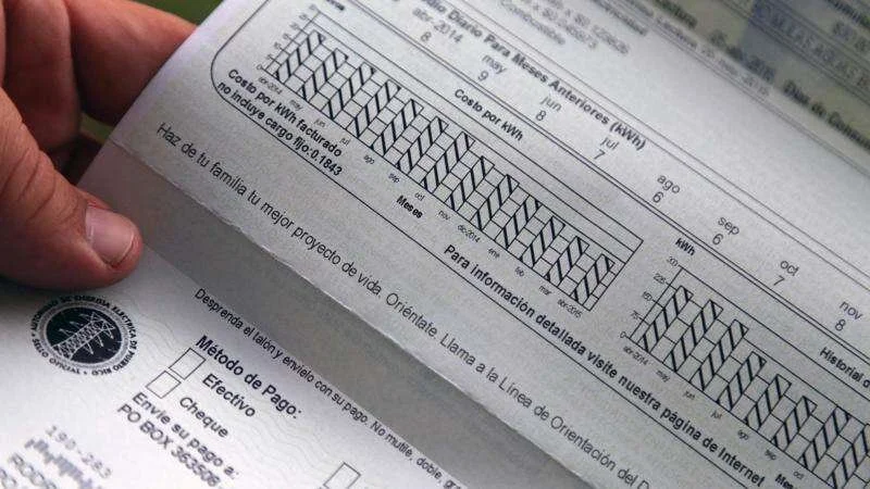
PREPA’s bill visualization tools were design using guidelines meant for a paper bill.
Design
We designed the app doing multiple iterations. Addressing the user’s pain point for each of the services listed was one of the most important goals. We design the app in short sprints, going from low resolution versions to high resolutions for each service. We started with PREPA’s key transactions first, payment, and then moved to secondary and tertiary services.
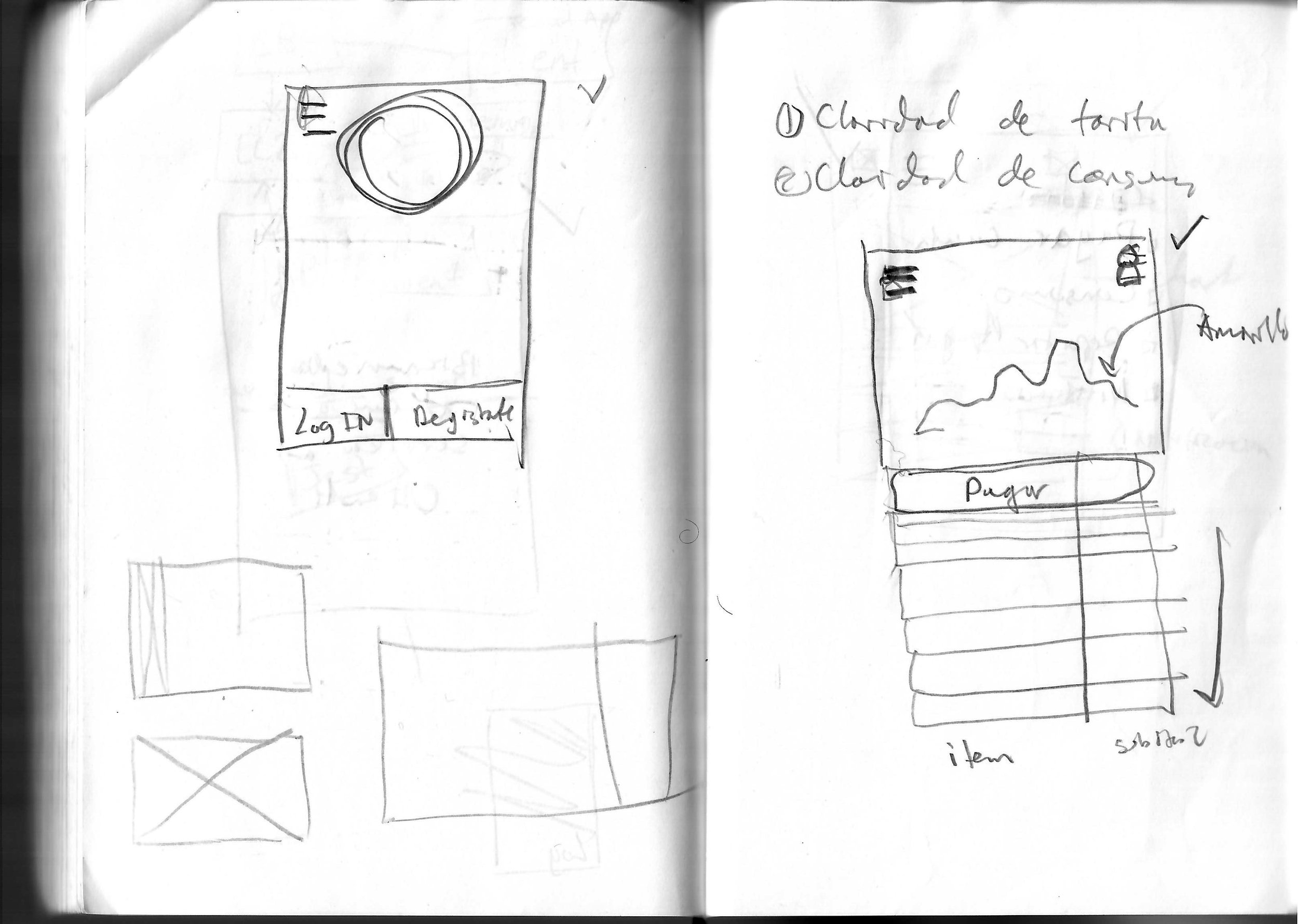
WireFrame
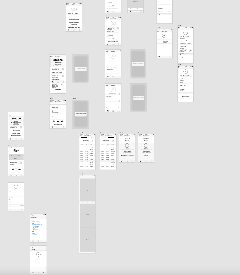
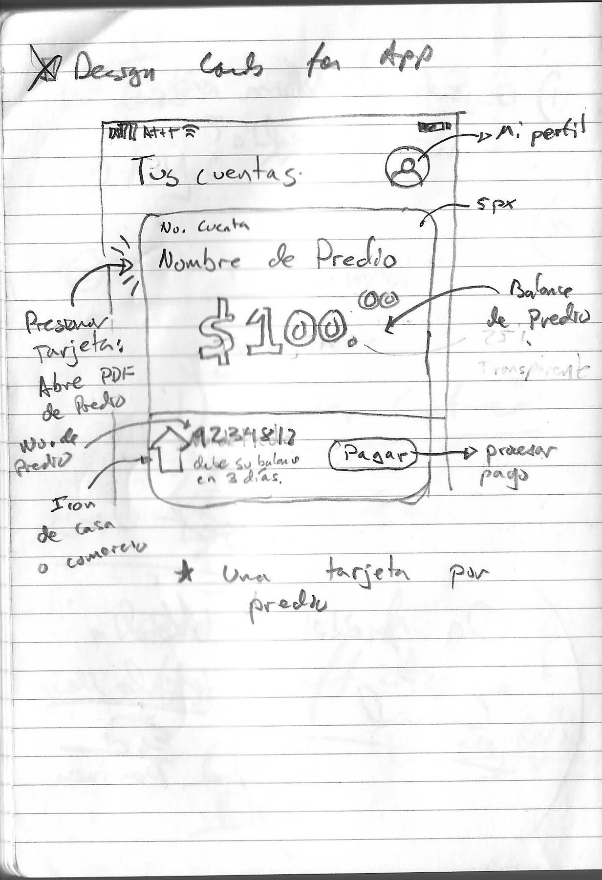
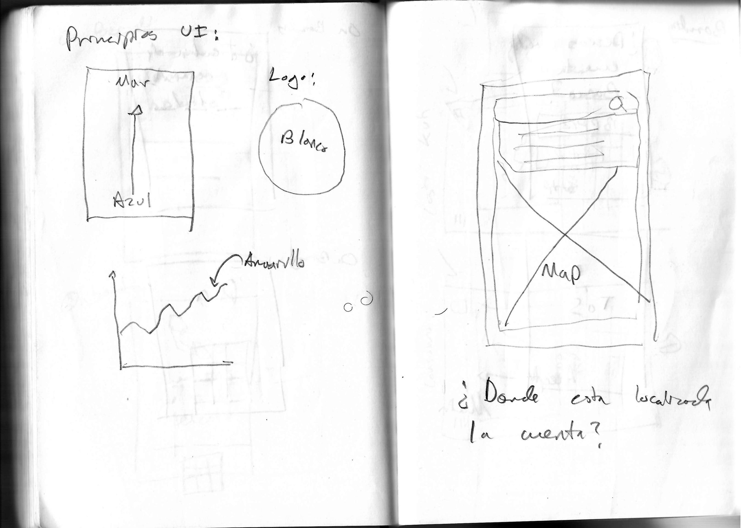
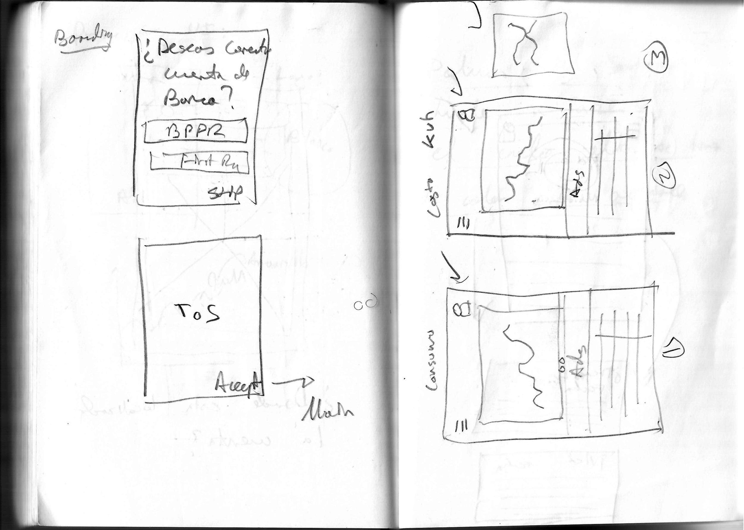
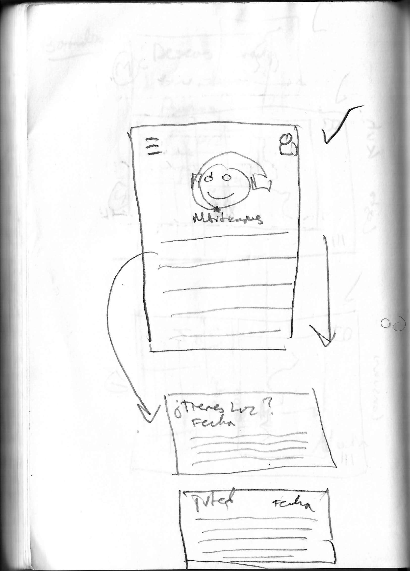
We sketched the whole app and confirmed with PREPA that the wireframes captured the web app as a mobile app. This allowed us to concentrate on the most important design issues without distraction about colors or icons. With the wireframes, we developed the idea that most transtactions should be completed by the user pressing one button.
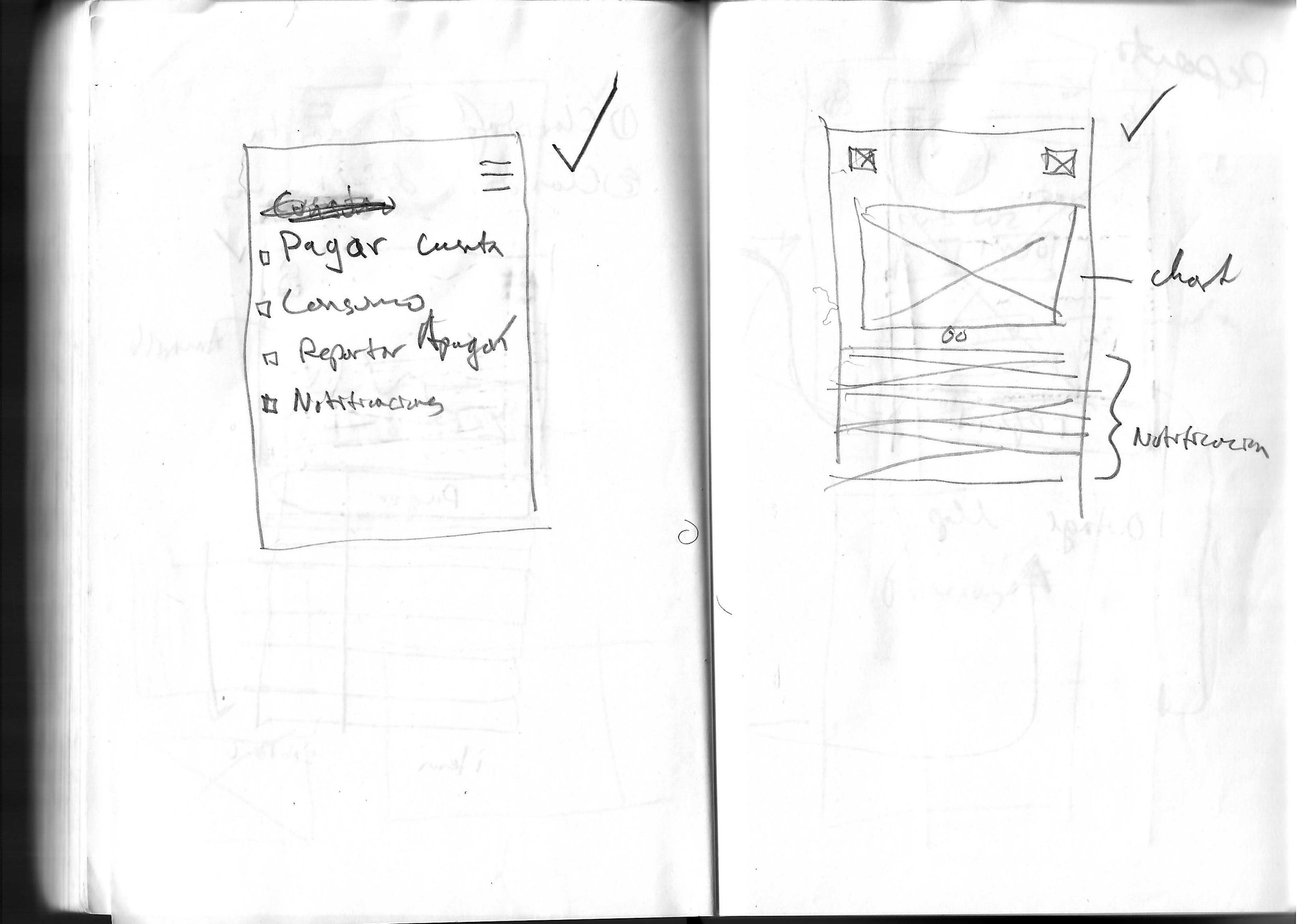
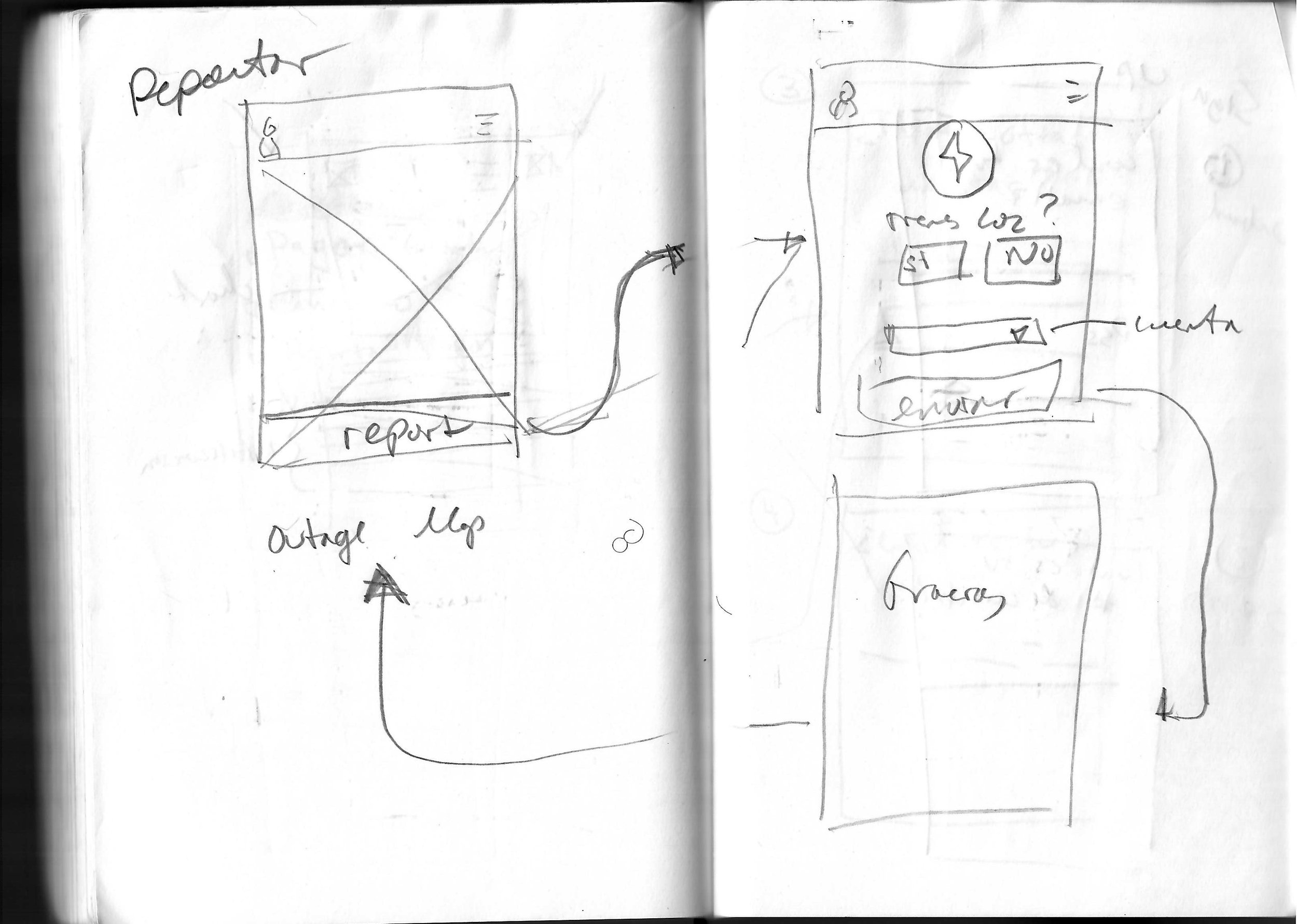
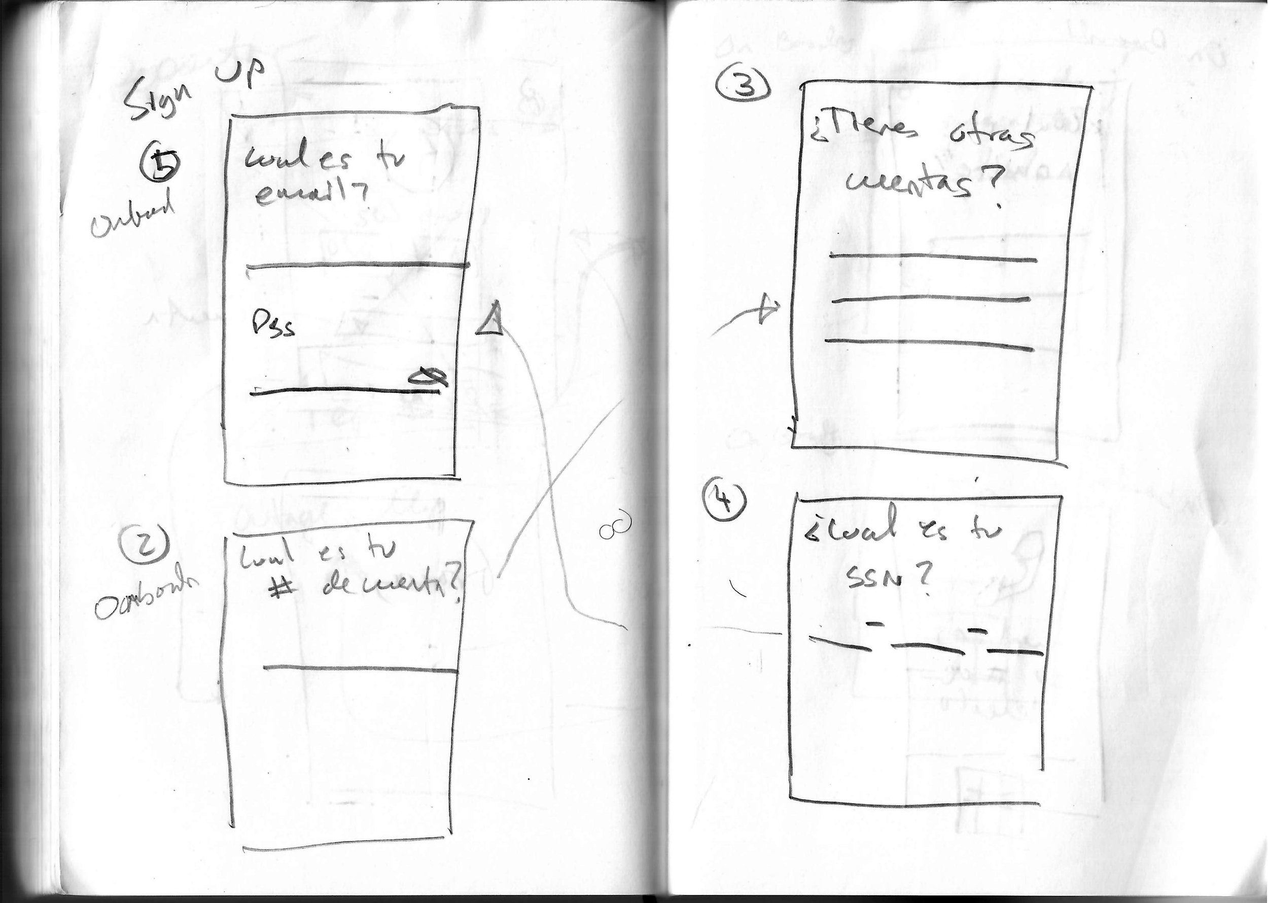
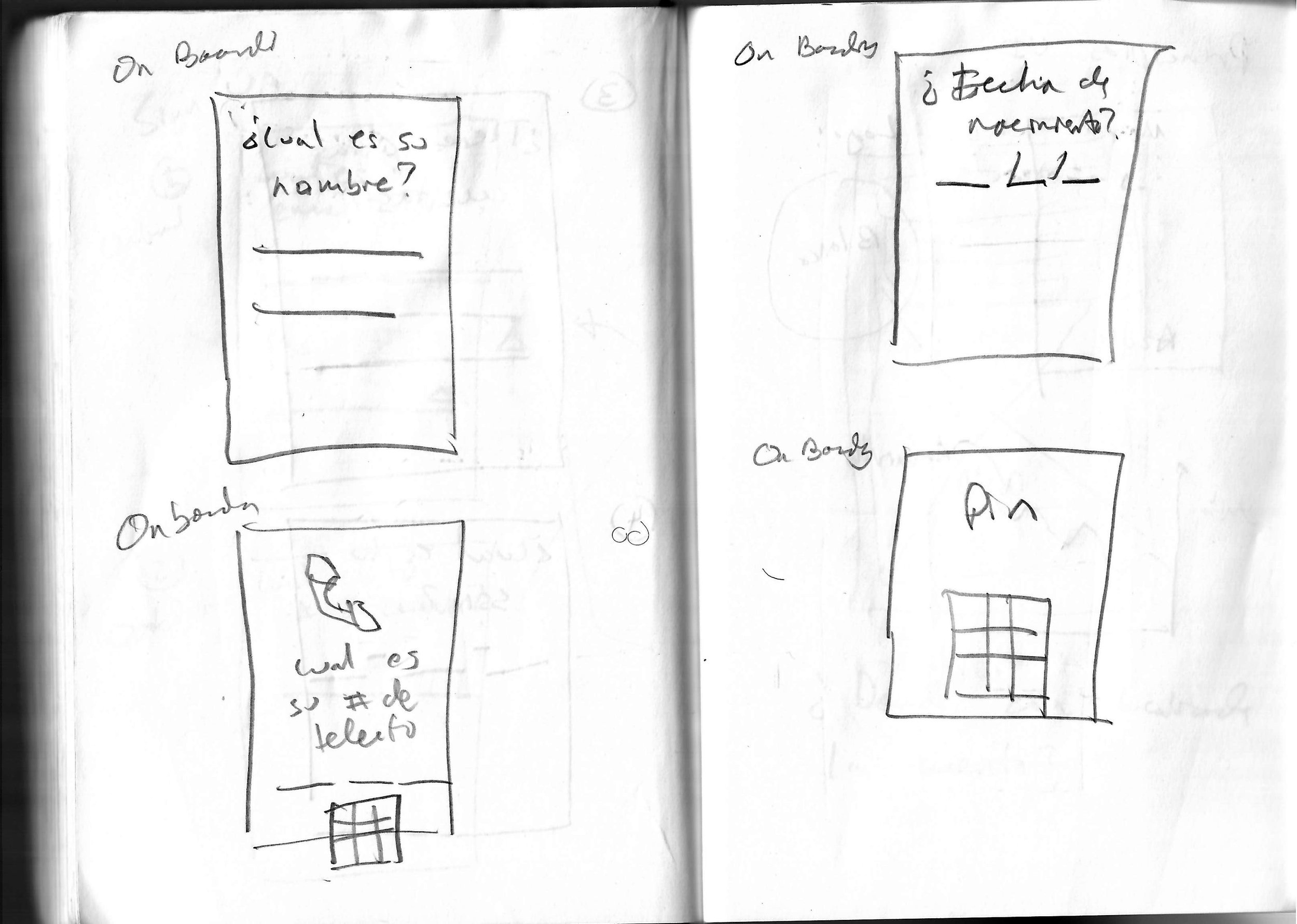
Low Resolution
We developed the low resolution Adobe XD version of the app by services. We concentrated our design first two key transaction: payments and reporting. This version had only one interaction: pressing buttons. We tested the low-resolution version with random users that matched our user personas on the street. We learned that given the demographics of the personas in Puerto Rico and based on our first user tests, we needed larger fonts, larger buttons, and better organization of information. We also observed that all users when presented with the prototype expected some level of interactivity when complex information was presented. The most recurrent activity was scrolling.
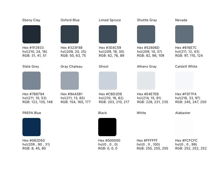
Colors: We decided to select a color palette that was relatively neutral and have the highlight colors match PREPA’s blue color from their logo.
Design Refinements
Before jumping into the high resolution mock up, we decided to standardized typography, color, card layout and dimensions.
Colors: We decided to select a color palette that was relatively neutral and have the highlt colors match PREPA’s blue color from their logo.
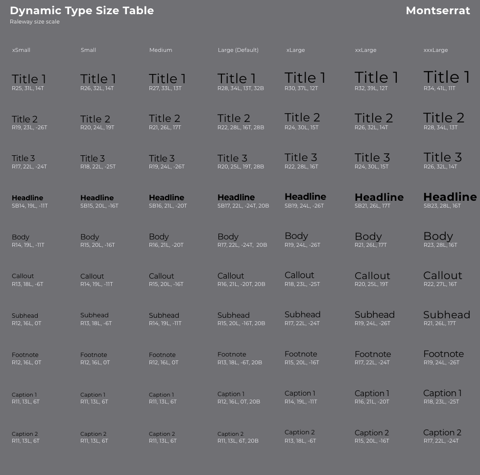
Typography: The font Montserrat was selected. It was perceived by users and PREPA as a serious but inviting font.
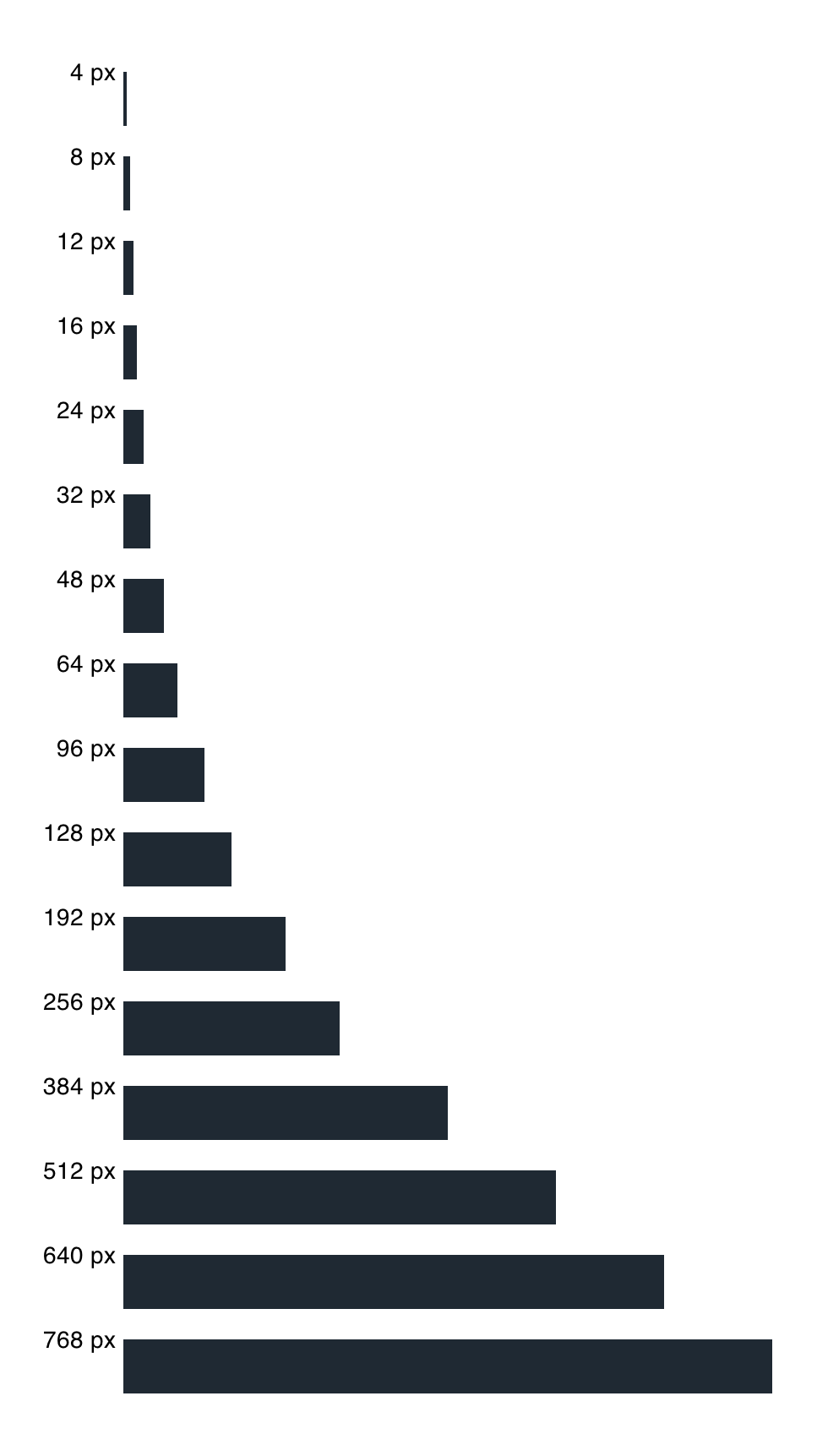
Spacing: I standardized sizes and spacing for every element in the app. Cards, buttons, icons, tabs, title headers, they all had to follow the dimension framework.
Sketch for the concept of a card
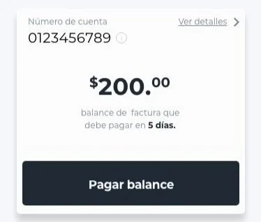
Account Card
Service Request Card
The High Resolution app was reorganized around the concept of a card.
Card concept in Adobe XD
High Resolution
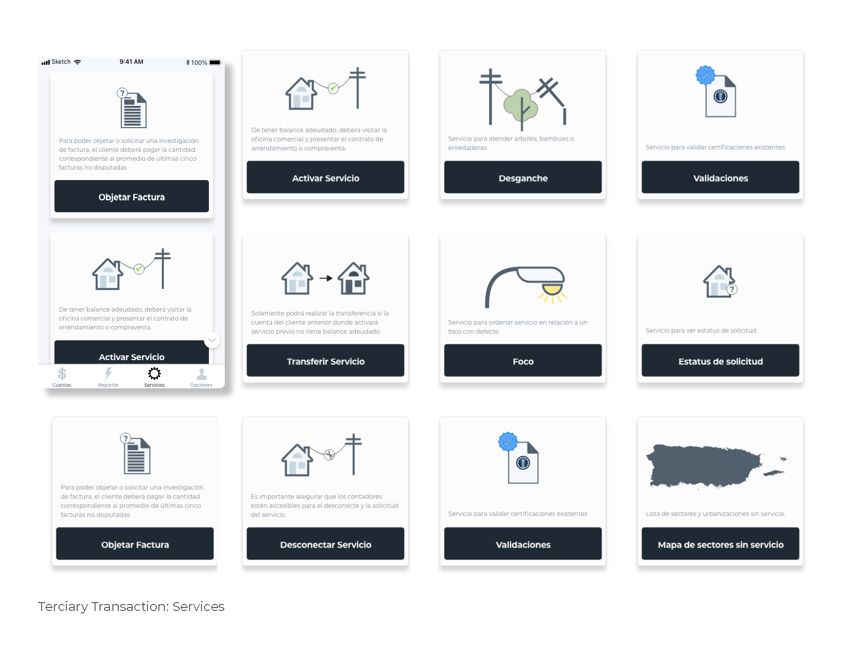
We took these lessons and stood up the rest of the app as a low-resolution version, presented the findings to PREPA and after addressing the UX findings. With the high-resolution design we reorganized the app around the metaphor of cards. Every service, information or action would be organized around a modular card with visual hierarchy for any information and call to actions. Finally, we decided that in order for the services card to look more inviting, we needed custom icons to capture the essence of the service requested.
Solutions to PREPA user’s pain point:
Making payment easier by streamlining payment.
Report power outage in two steps.
Visualize outage regions on Apple or Google Maps.
Use modern UI libraries to visualize bill on the app.
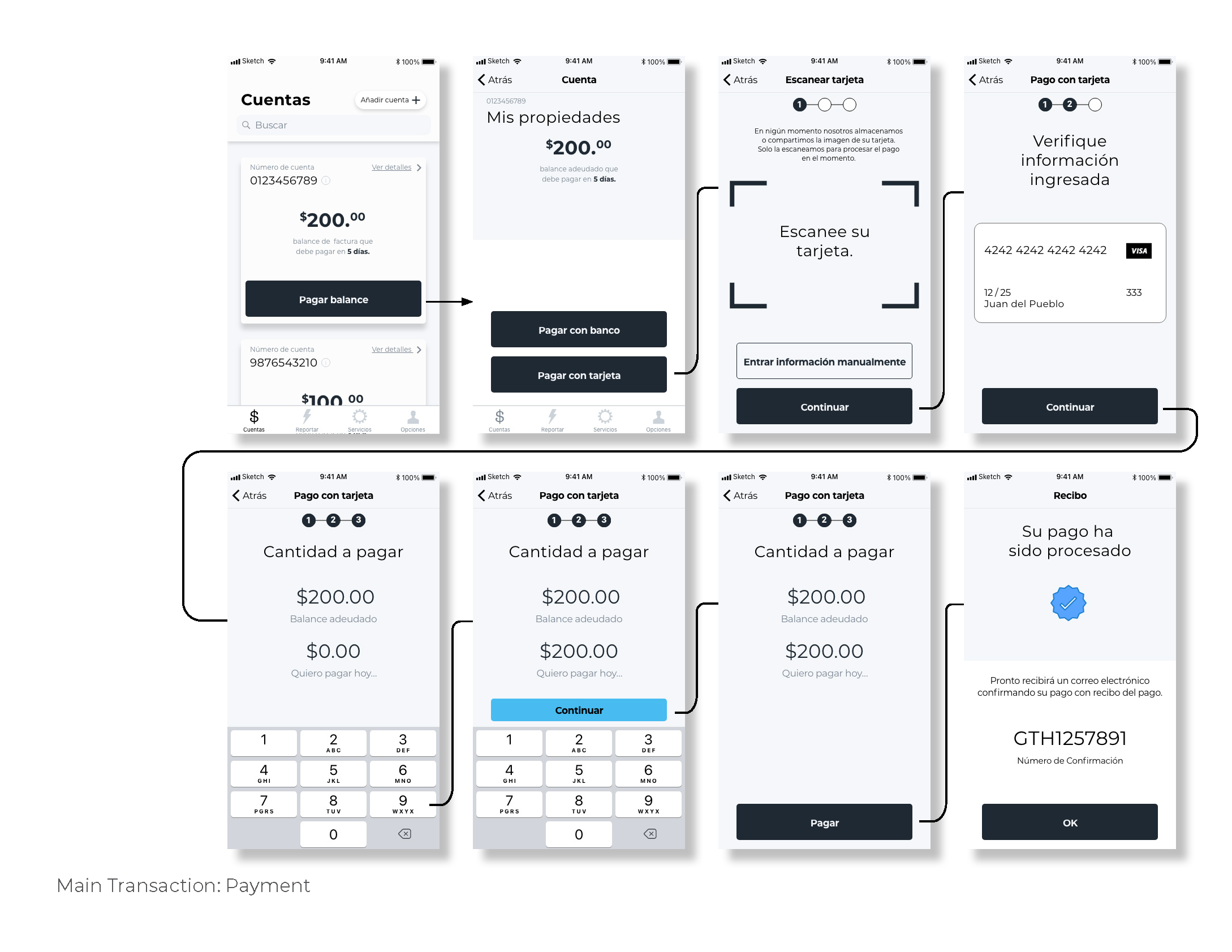
Key Transaction No.1: Payment with credit card or ACH. User’s wanted the app to save their payment information. Regulatory agreements did not allow PREPA to do that, so we decided to stream line the card processing payment by allowing users to scan their cards with the smartphone camera.
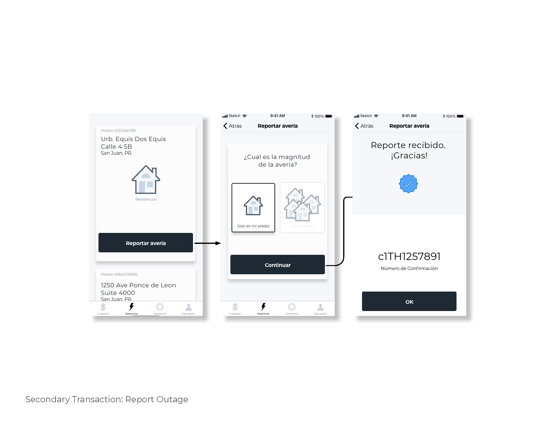
Key Transaction No.2: Reporting power outages.
Key Transaction No.3: Reviewing repair brigade status. The card dynamically changes status depending on the work status.
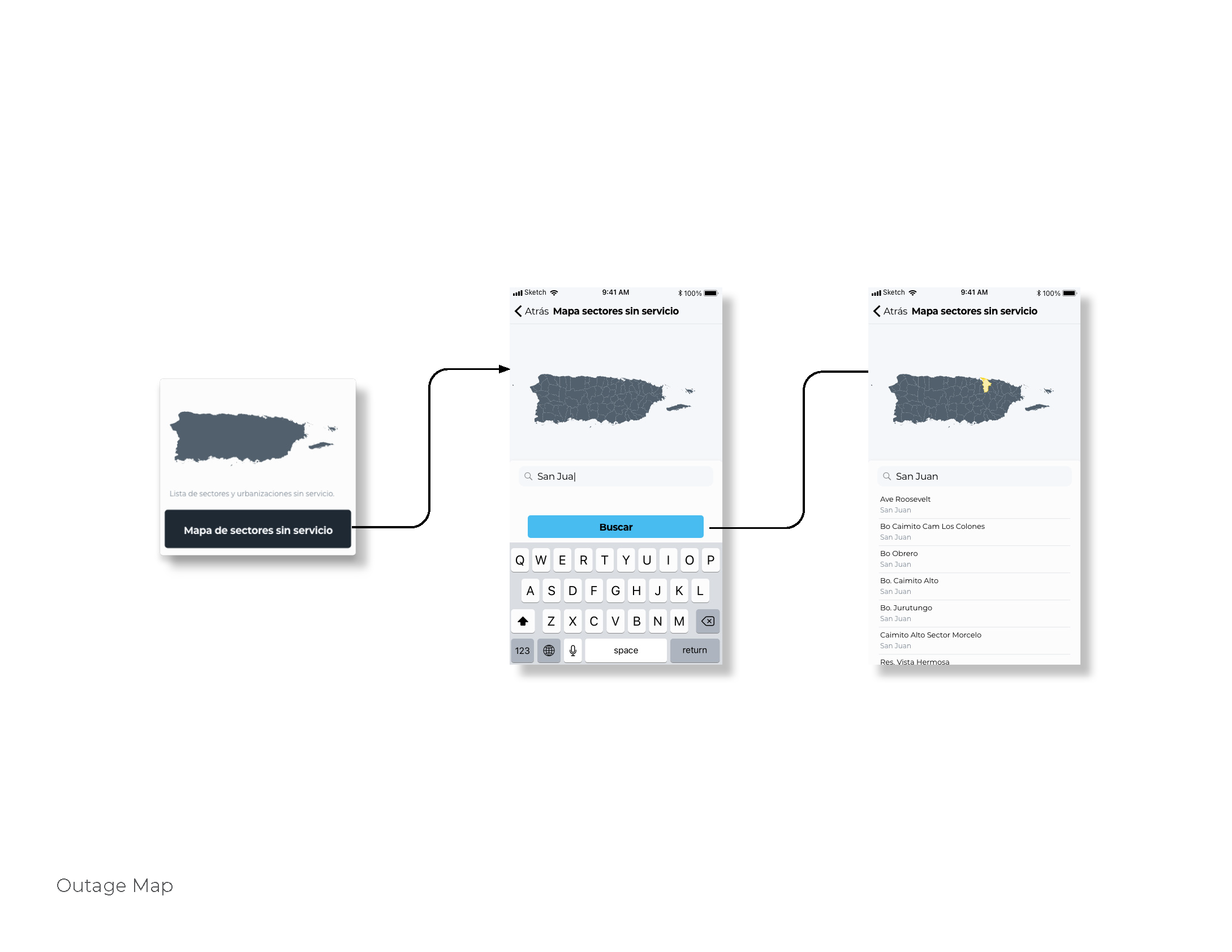
Key Transaction No.3: Modern Outage Map. The map highlighted the municipality with the power outage and displayed the barrios and sectors with no power.
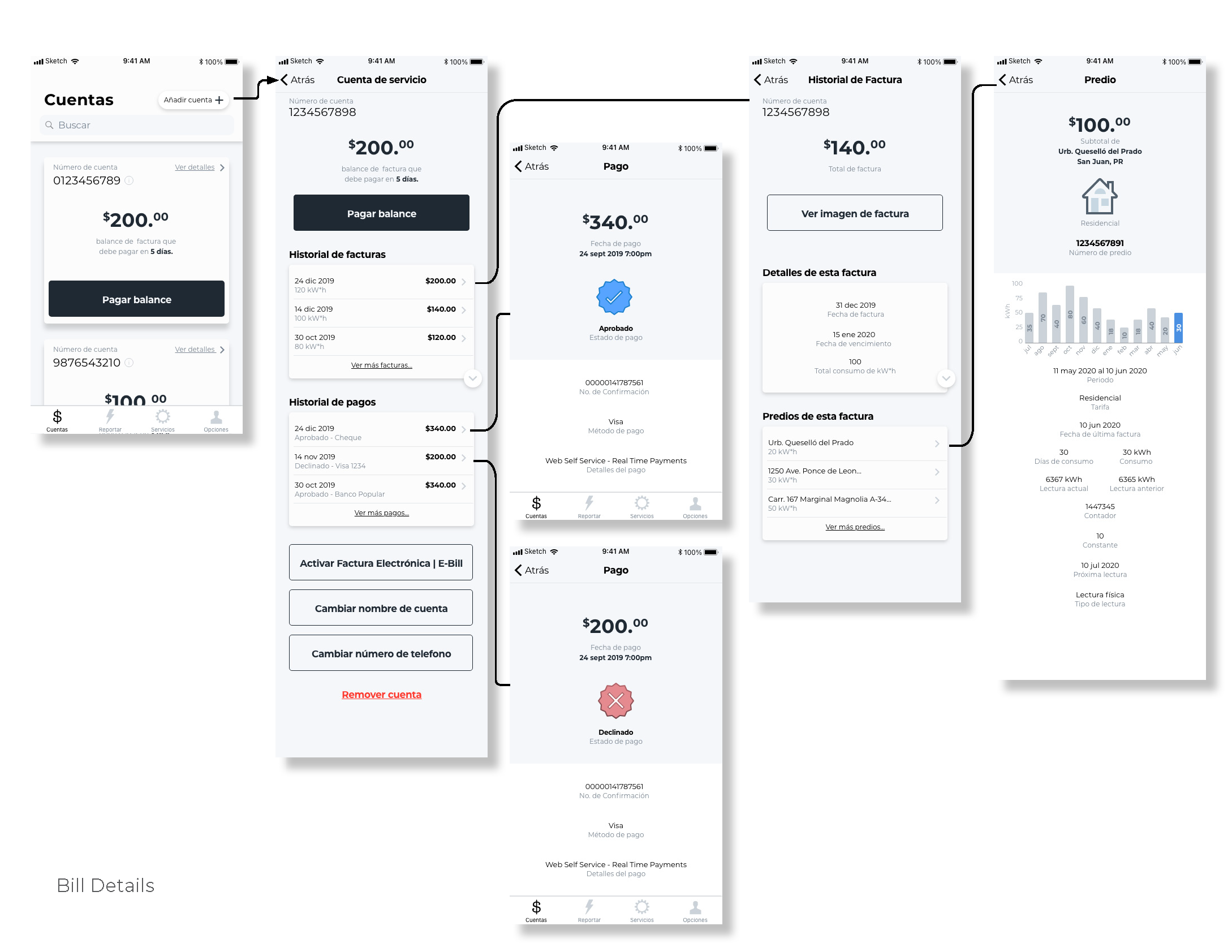
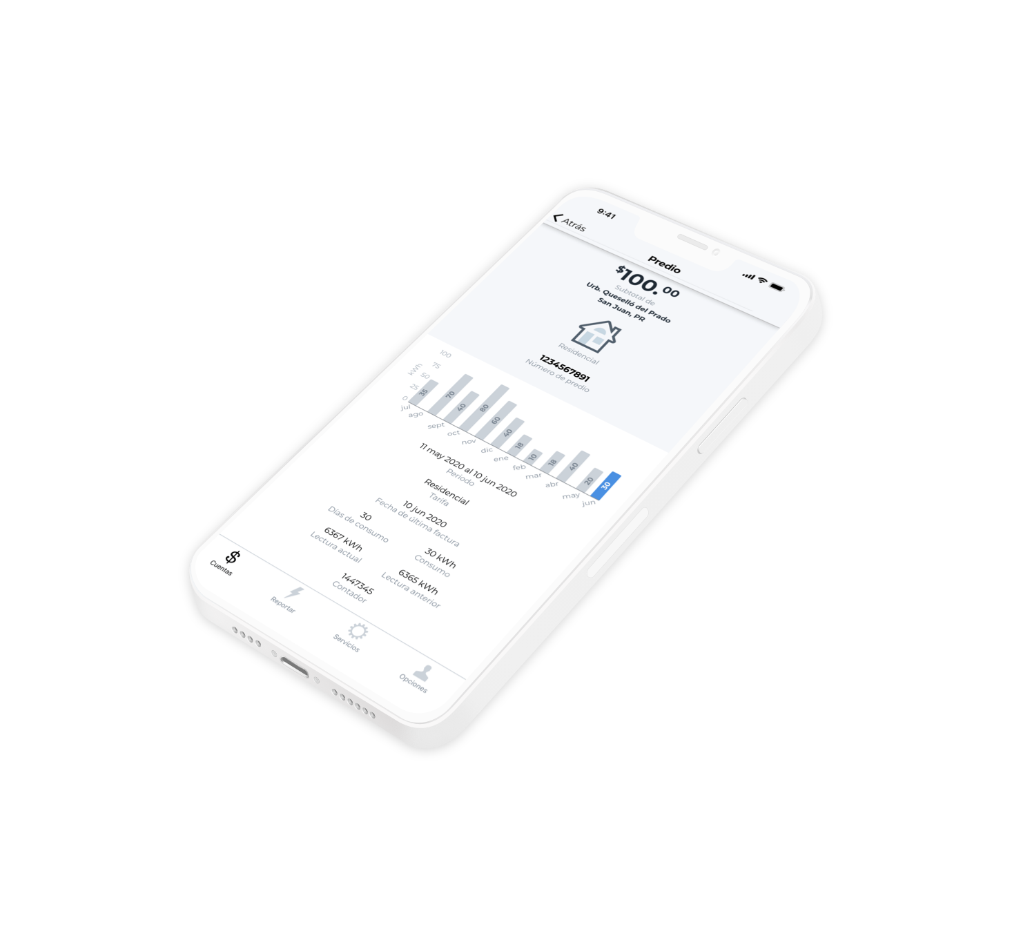
Key Transaction No.4: Modern Bill Details. Users wanted an intuitive way to see their payment and consumption history by premise.
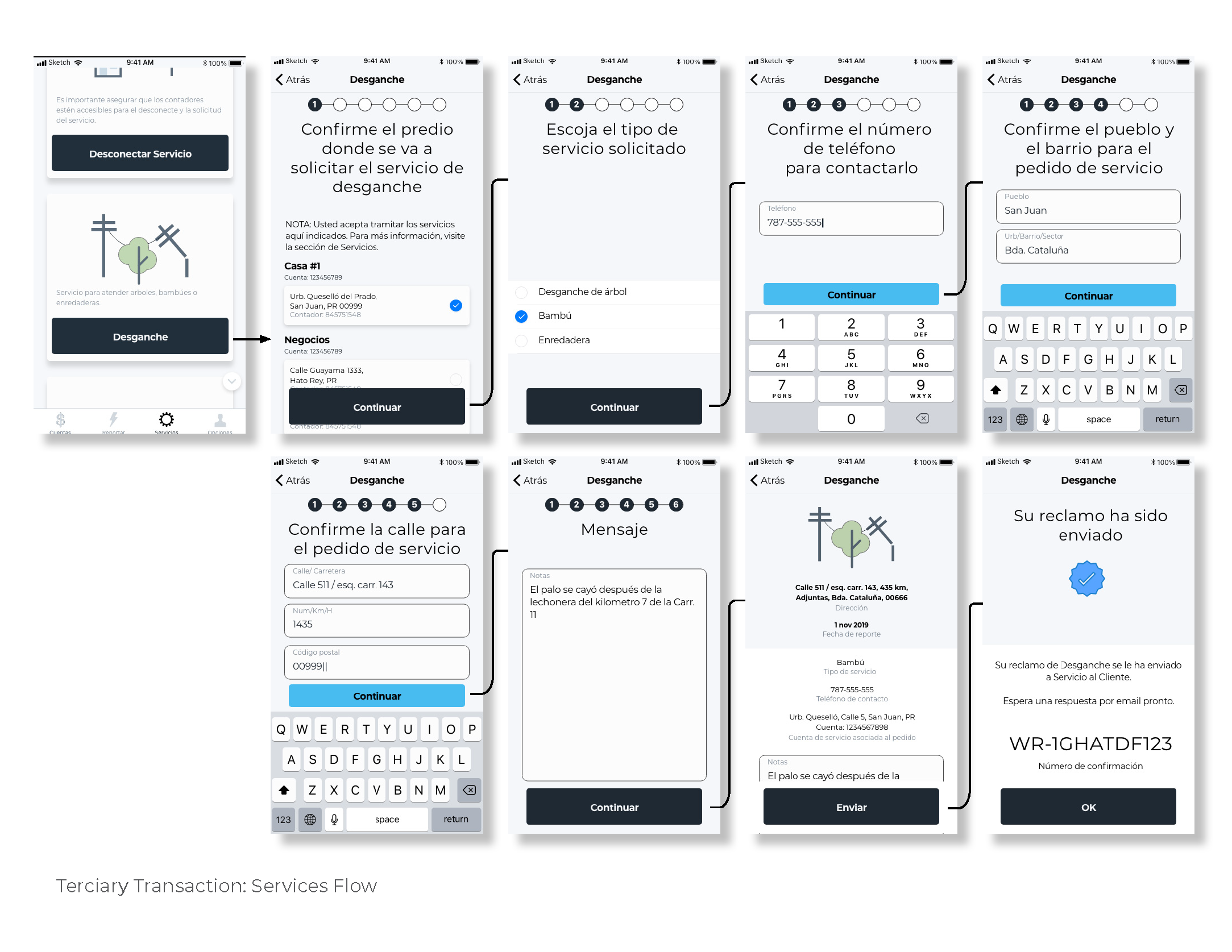
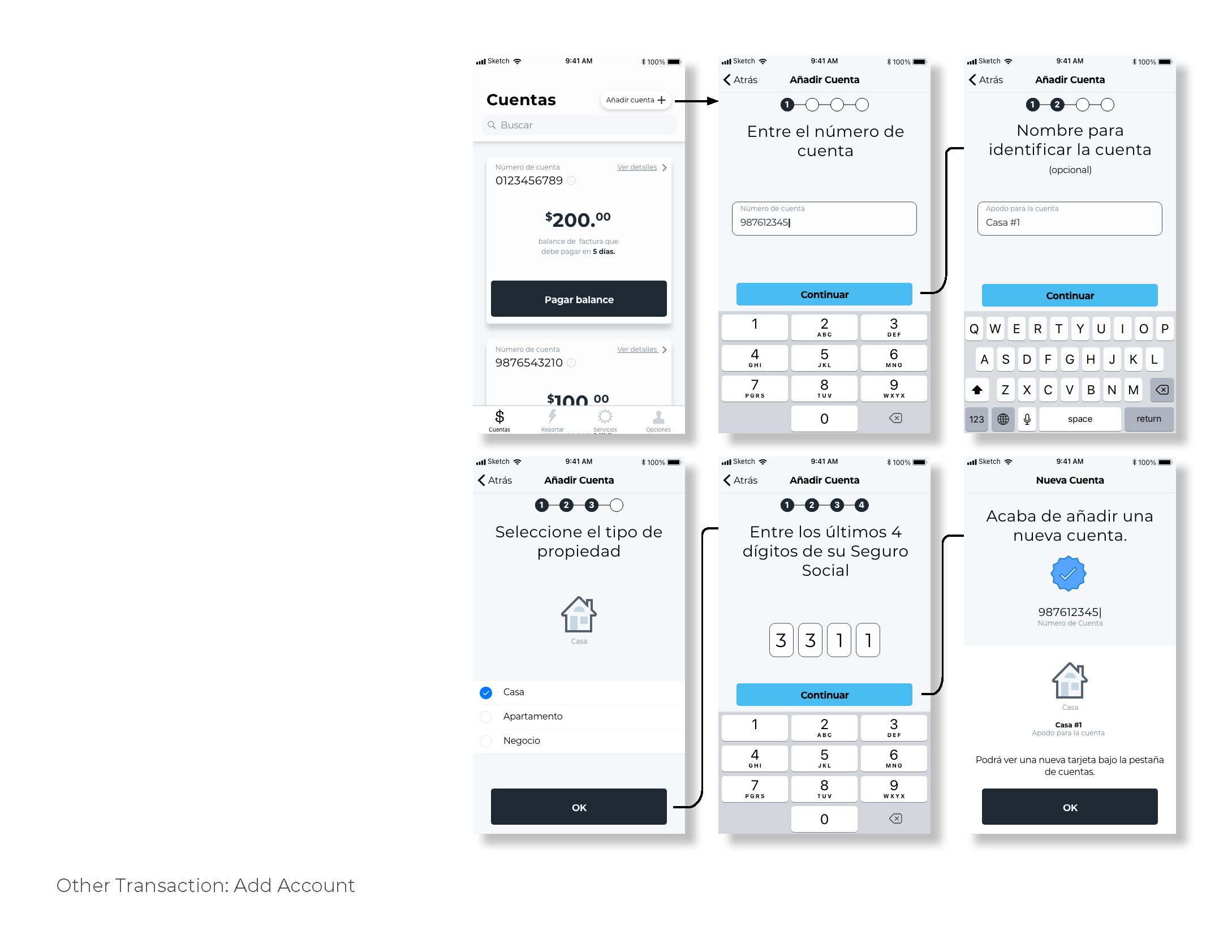
Secondary and Tertiary Transactions: Services were standardized to minimize user form. Whenever possible, addresses associated with premises were pulled from PREPA’s user database. A step counter was introduced after users complaint not knowing in what step in the process they were in. This design was used for all service requests.
Onboarding: The step counter and user input forms were also used to improve the user experience when starting a new account or adding a new premise.
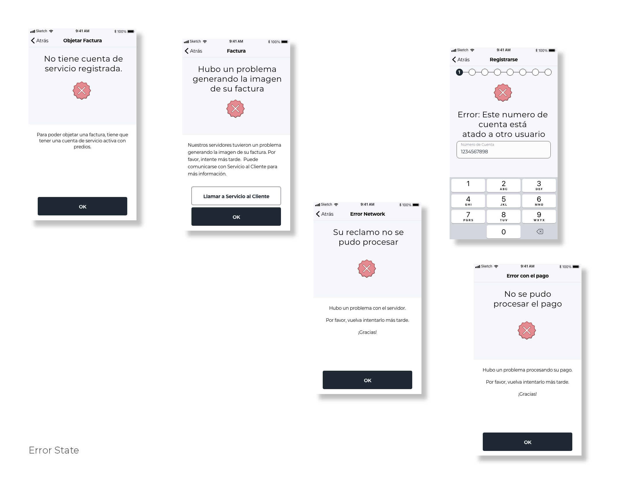
Errors and Exceptions: One of the challenges having a multi-service customer service platform is how to handle errors. A standard error icon was used to be shown at the moment the user input some erroneous data or a network request was not completed.
Usability Testing
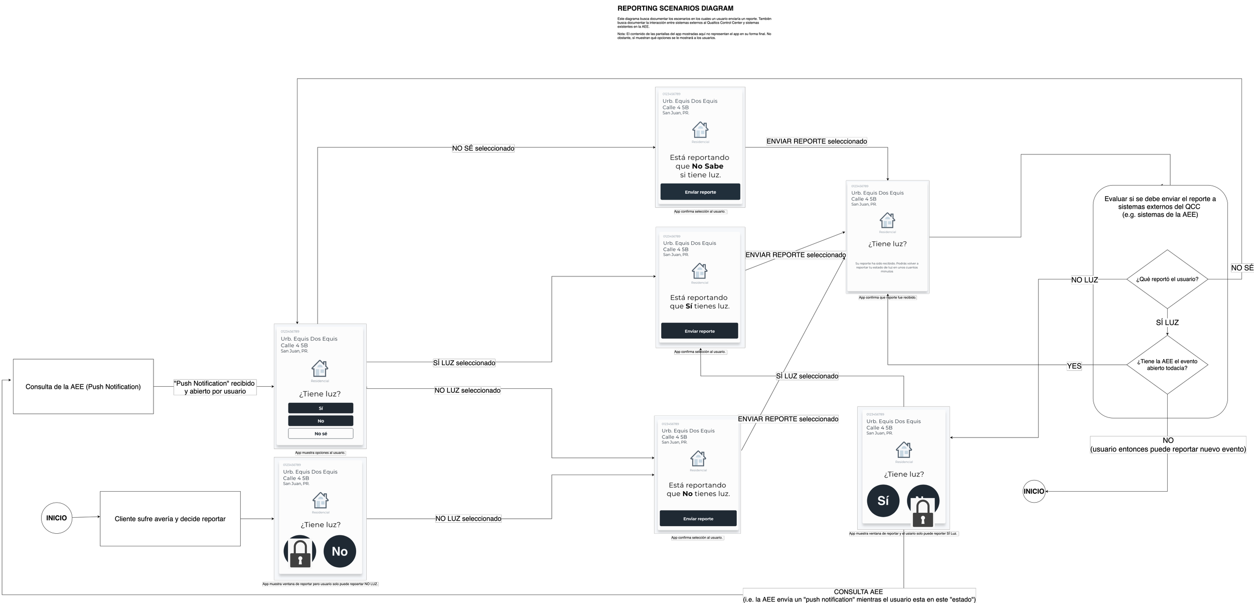
Before deciding to publish the app, we decided to conduct a final set of usability tests. We had diagrams that documented each of the steps users had to take to complete a given task. We tested the app on the street, with random users that fit our user story profiles. We observed our subjects and documented how each of the users could complete all of the tasks assigned. After these last series of test, we showed the findings to PREPA and communicated that the app was ready to be published.
Method:
Select a random user in the street that would cooperate to test the app
Ask them to complete a given task
Observe how they complete the task.
Confirm that it matches assumed steps in the diagram.
Example diagram of the steps the user needs to take to report a power outage. For each service we had a diagram.

Production
Xcode demonstration of PREPA’s app.
Summary
The app was never release to the clients due to internal reorganization, but the app was ready for production. The process of doing market research, user personas and user stories, wire frames, low and high level design all contributed to developing an app that was reviewed by early testers as a success.
Lessons
It was important for me to understand the larger market that I was designing for. Early research can helped me avoid mistakes others have made.
Multi services platforms like utility systems are best designed and developed by focusing on an individual service.
Focus on key transaction first. This allowed for early discoveries that I could generalize as the new services were designed, developed and tested.
Utilities operate almost as a multi-sided market: Both the utility and the customer have expectations about the services offered in a customer service app. I learned that these should be treated as two different design problems.

