
PREPA CRM
A modern customer relations manager
PREPA CRM is a web app for sending notifications and managing customer service requests via the PREPA mobile app.
Project Specs:
Duration: 6 months
Development Stage: Developed (never released)
Tools:
Adobe XD
HTML, CSS
Javascript, React
Deliverables
User surveys
UI kit
Low-fidelity wireframes
High-fidelity mockups and prototypes
Usability tests
Working Protype
Roles
User Experience (UX) Designer
User Interface (UI) Designer
Interaction (IxD) Designer
Overview
PREPA, one of the largest power utilities in the territorial United States, requested a customer relation manager app for managing user-submitted information via the mobile app. The web app visualizes each premise with its outage state, filtering users geographically and temporally. The web app can also send template notifications to iOS and Android users. Customer service agents can further customize notifications to customers and send user-specific messages.
Problems
PREPA has multiple channels of communication with its customers. PREPA used social media to broadcast time-sensitive information to its customers. PREPA also managed grievances via social media platforms. Most complaints on social media were about power outages. There was a disconnected experience between using their web app to fill out claims and engaging customer service via phone or social media.
We had two challenges:
1. Transition PREPA Customer Service from using social media to using their mobile app notification system to broadcast and communicate with their customers
2. Provide a seamless experience for PREPA’s customer service agents to process claims submitted via the mobile app.
Solution
We built PREPA a SaaS web app with a modern notification system and a table to view all claims submitted via the app.
Solution to challenges:
1. The SaaS app had a map system that visualized all of PREPA’s client power status and allowed Customer Service agents to send boilerplate notifications.
2. The SaaS app organized user-submitted forms into tables that could be filtered, searched, and sorted. For specific services, we included a call to action button.
Research
Findings:
1. PREPA mainly used Twitter to broadcast outage and repair messages.
2. PREPA clients used Twitter to post complaints and included photos, claim numbers and other information.
3. PREPA rarely responded to client disputes.
We analyzed the communication methods PREPA used with its customers. I mainly concentrated on researching their Twitter account. PREPA clients were very active on Twitter and used it to post their outages or publicly dispute a bill. PREPA’s Twitter account rarely responded to these comments on their posts and concentrated on using the platform to broadcast planned outages or to report on unforeseen events. PREPA used what seemed to be template messages, but around 20% of their posts had grammatical errors.
PREPA used Twitter as the main method of communicating with customers
PREPA clients used Twitter as a public forum to file complaints.
PREPA clients posted pictures and claim numbers for support.
Design
The design was developed through multiple iterations, refining the scope and the layout each time. What started as a broad scope for a complete CRM during the wireframing sessions ended much simpler. A two-tab app that could send template notifications to all users and a table view to be able to review requests incoming from users.
Wireframe
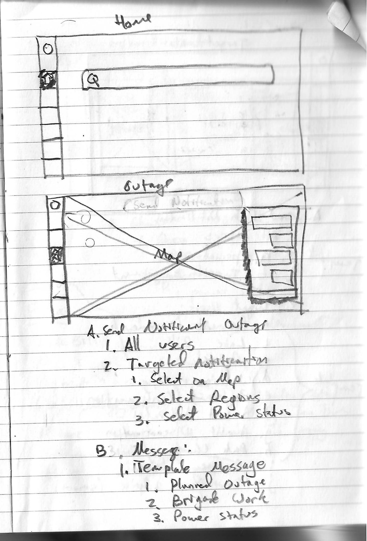
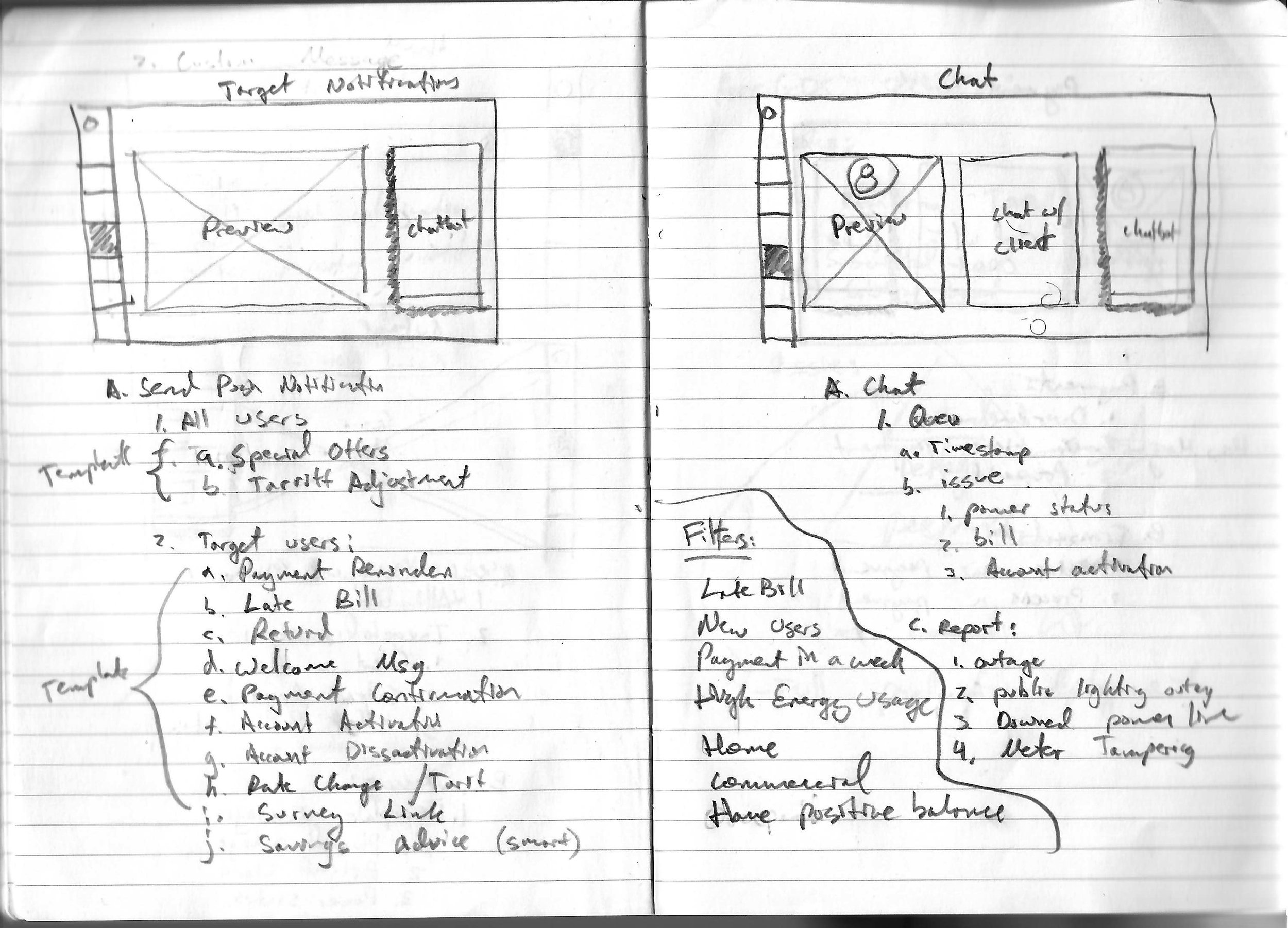
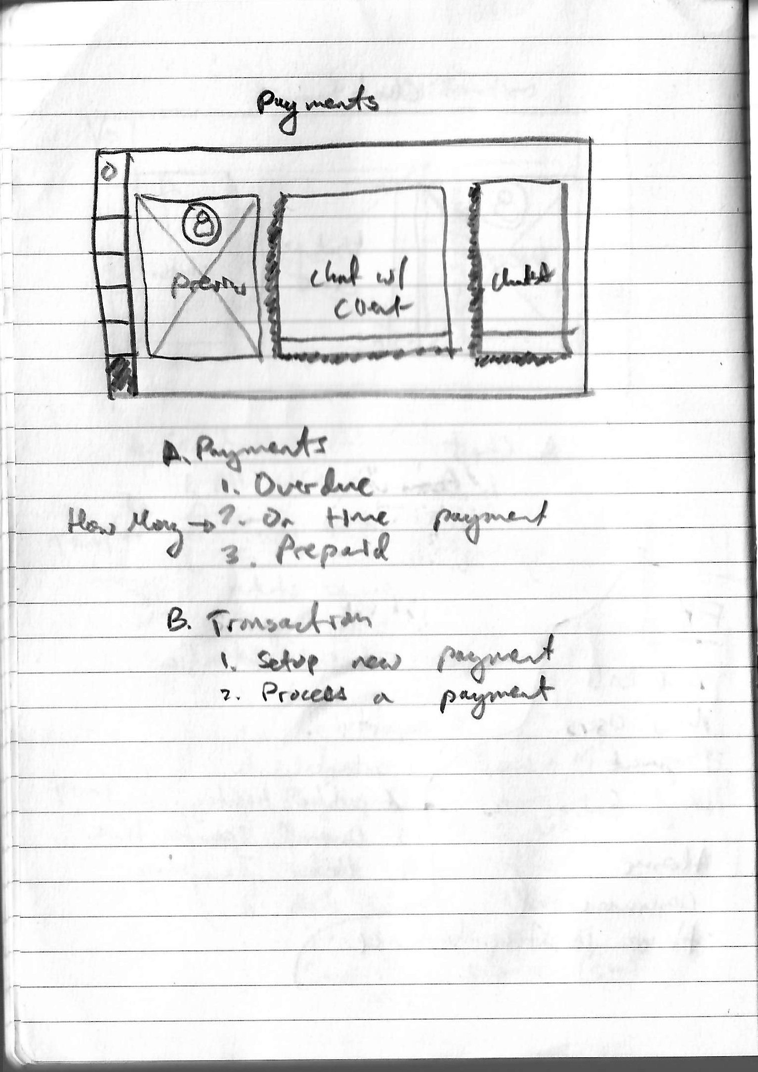
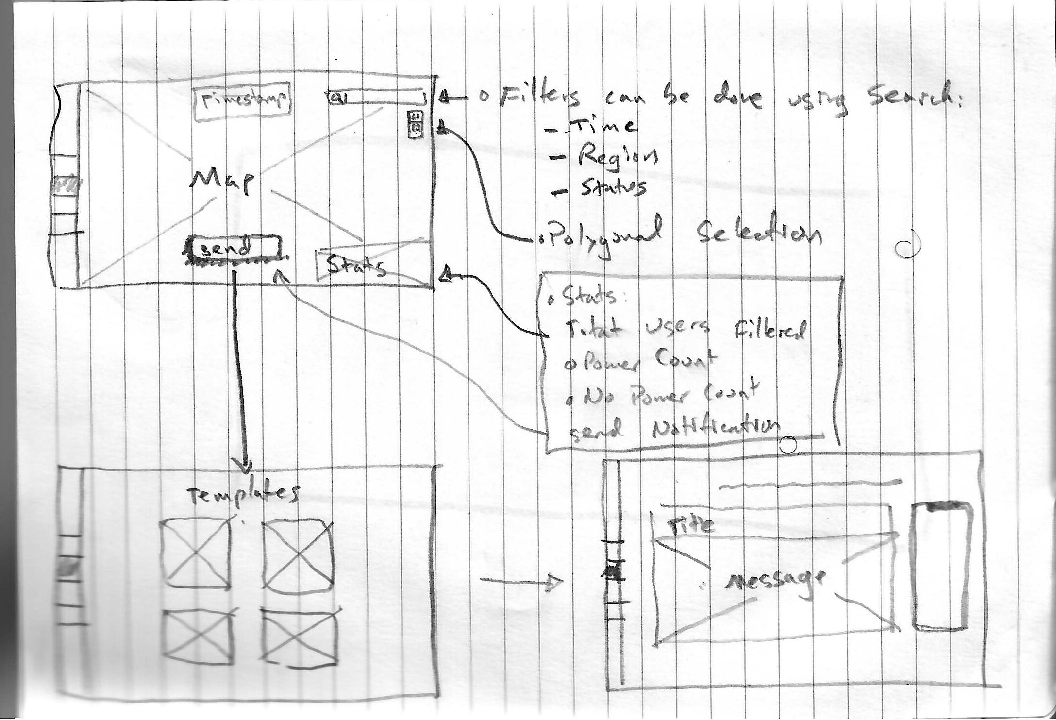
The wireframe scoped a CRM system that allowed customer service agents to send notifications using a map system and to be able to chat with customers while looking at their information on their screen.
It also included a chat system for PREPA Customer Service representatives to engage directly with customers via the app and avoid PREPA clients posting their complaints on Twitter. This feature allowed Customer Service Agents to tailor their response for each user and to be able to understand their particular grievances.
Design Patterns
Taking inspiration from PREPA’s mobile apps, we decided to reuse the same colors, typography and design system from the mobile app.
We applied the same color palletes from the app to PREPA CRM.
Design Iterations
I developed the design in quick iterations over three months. As I learned more about how the OMS system worked and how the Customer Representative would use the tool, I modified the Adobe XD file to reflect the design findings.
The main evolution of the design was for the map notification system. I changed the layout from having a series of buttons floating over the map to having a ribbon experience where all the call-to-actions were on a horizontal band on the upper part of the map leaving the rest of the real estate accessible for visualization.
Version 1 of CRM. Home View
Version 2 of CRM. Home View.
Version 3 of CRM. Home View.
Version 4 of CRM. Home View.
Version 1 of CRM. Filtering districts.
Version 2 of CRM. FIltering Districts.
Version 3 of CRM. FIltering Districts.
Version 4 of CRM. FIltering Districts.
Using Material Design
To help minimize development time between design ideas and implementation, I decided to use off-the-shelve components from Material UI‘s React library. I used the button, the toggle button, the autocomplete and radio selection, and the calendar components and slightly modified them to match the design patterns of PREPA.
I designed copies of the Material Design components in AdobeXD. If an element did not exist, I designed it to be a composite of two or more parts.
The outage status filter provided situational awareness by giving the user a preview of the total aggregate number of clients under each filter.
This was the original design for selecting regional filters. Later, we found that with a list of 78 regions, it was better to use the MUI Autocomplete Component.
Temporal components proved to be a challenge. Our solution was to use the most common discrete-time windows for outages in the PREPA system. A calendar view provided more complex ways to query users using start-end dates and the time of day.
High Resolution
I quickly ported our High-Resolution design from Adobe XD to Javascript and React. Some of the interactivity was missing for some of the components, but that was better to refine in a coded prototype instead of figuring out those details in Adobe XD. Material Design also helped to quickly resolve interactive elements like the experience of auto completing or filtering a table. I also finalized some color corrections to the map at this stage.
PREPA QCC’s interactive filtering capabilities show municipal and custom selection. The demonstration also shows temporal and power status filtering.
Usability Testing
We recruited a limited number of friends and family who had no experience or knowledge of running a CRM system to do usability testing. This limitation was due to the client’s requirement. Regardless, we wanted to simulate if new Customer Service Agents with no prior training could complete the task assigned. Tests were recorded and presented to PREPA. The testers completed all tasks.
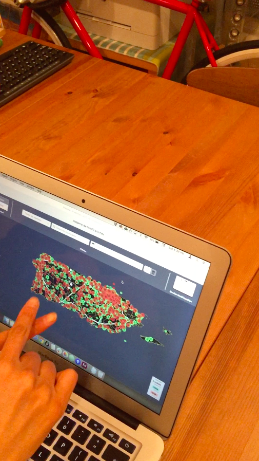
Usability Testing - Map Initial Settings
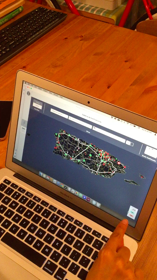
Usability Testing - Map Filter


Summary
PREPA requested a modern CRM tool that could reimagine how they broadcast time-sensitive information to their customers. Designing the broadcasting around temporal events like outages proved to be a geospatial and scheduling challenge. Using modern off-the-shelve UI tools like Material UI allowed us to quickly stand up UIs that dealt with the complexity of filtering reports on a map by geographic region and time. I use the same Material UI tools to build template messages and the table views of user-submitted service forms. The tools were developed and ready for production but were never released after LUMA took over the Transmission and Distribution of electricity in Puerto Rico.
Lessons
1. It was important for the client to develop this tool as fast as possible. Using modern React libraries like Material Design helped me quickly stand up UI interfaces with no worries that coding these features would be difficult.
2. Interactivity of a tool can play a crucial role in the overall design. When a design requires multiple overlapping interactions, it is better to iterate various versions until a client approves the intended interactivity.
3. It was vital for me to understand the problem of broadcasting using social media. Careful observation of how PREPA structured its broadcast copy allowed me to propose a design solution that improved quality control for their messages and helped Customer Service Agents avoid common mistakes.


