
Property Portal
A web app for understanding a city’s building and zoning regulations.
Vivacity’s Property Portal centralizes all information available about a property in NYC, including NYC’s zoning code which is notorious for being hard to navigate and interpret.
Project Specs:
Duration: 9 months
Development Stage: In Production
Tools:
Python
Adobe XD
React JS
Esri ArcGIS.js
Esri ArcGIS Enterprise
NYC Geocoder
Deliverables
Web App
Low Resolution Design
Mid Resolution Design
High Resolution Design
Roles
UX Research
UI Prototype
UI Design
Web Map (GIS)
Back-End 3D Content
Overview
Property Platform was built as the first product I designed on my own for my company Vivacity. The app centralizes all information available about a property in NYC, including NYC’s zoning code which is notorious for being hard to navigate and interpret. The challenges in designing our platform came from interviewing professionals in the real estate and architecture sectors. The main pain point for these users was the inability to understand the full impact of zoning. They also complained that they had to visit five websites to gather all the information for a property. They also complained that they had to spend weeks gathering all the information.
Problems
We needed to solve three challenges:
1. Design an intuitive way for users to gather all information about a property.
2. Allow users to save and share their property searches.
3. Lower the barrier of entry and friction for users in the real estate sector.
Solution
1. I designed a one-stop-shop platform where users can have a Google Maps experience of searching for a property by their address and finding all the information related to the property.
Research & Development
I conducted research for Property Portal by analyzing the existing methods of discovering zoning limitations. In NYC, users relied on Property Shark and the NYC Department of Planning’s (NYC-DOP) Online Zoning Platform (Zola). Property Shark’s platform only showed summary information about the applicable zoning, while NYC-DOP had a disconnected experience for navigating a property’s applicable zoning. NYC’s authoritative zoning website was mostly map-based; it used old Esri map technology, and there was no direct link between the zoning maps and the zoning text resolution.
The research highlighted the need for a modern and efficient method of discovering zoning limitations, which led to the development of the property portal platform.
Property Shark was the main tool our target users used.
The platform only provided partial zoning information about a property.
NYC’s Department of Planning Zoning Explorer
The map did not have a Google Maps experience of searching and selecting properties. Users had to click multiple times on an old UI to get the preliminary information they were researching. The ZOLA portal has been updated and addresses some of the UXUI findings we made when designing Property Platform.
NYC’s Zoning Text Explorer
Users had to open the zoning text on a separate tab and visually correlate what was on the map with the zoning text.
Design
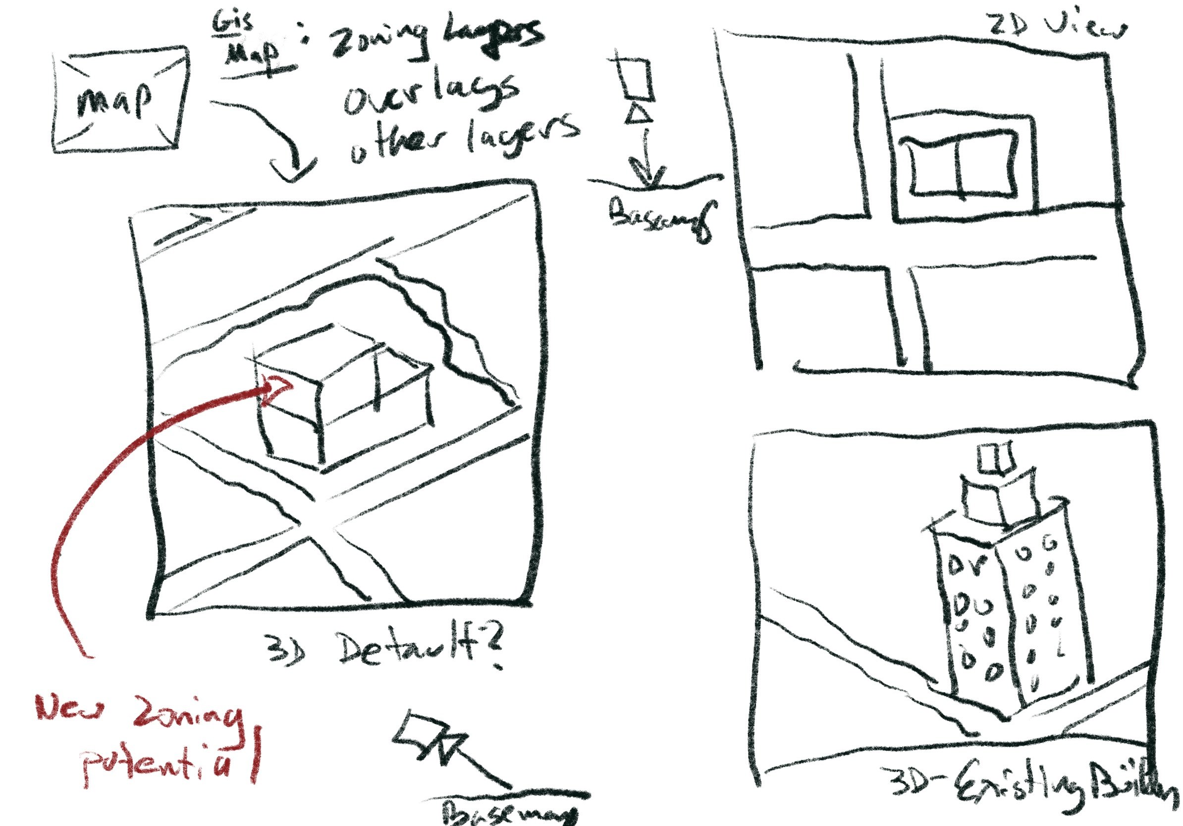
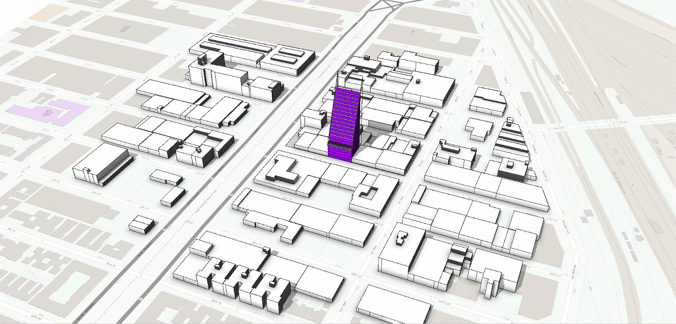
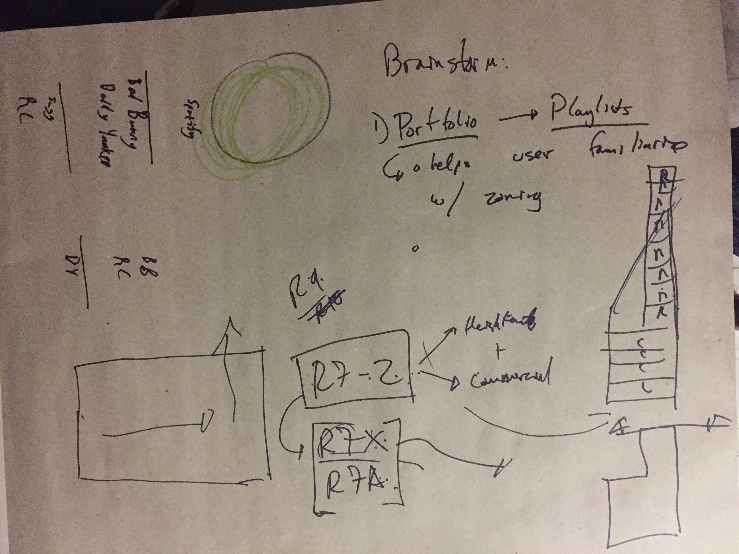
Regular users of Property Shark and NYC’s Zola, wanted a map that would connect to the zoning text. Some more advanced power users wanted to see the development potential of a property. This required us to not only grab the information at a high resolution from the zoning text but also interpret it in a 3D map. I worked with various iterations, starting with sketches that captured the general idea, then moving on to low-resolution box diagrams, and finally mocking up high-resolution views of the platform.
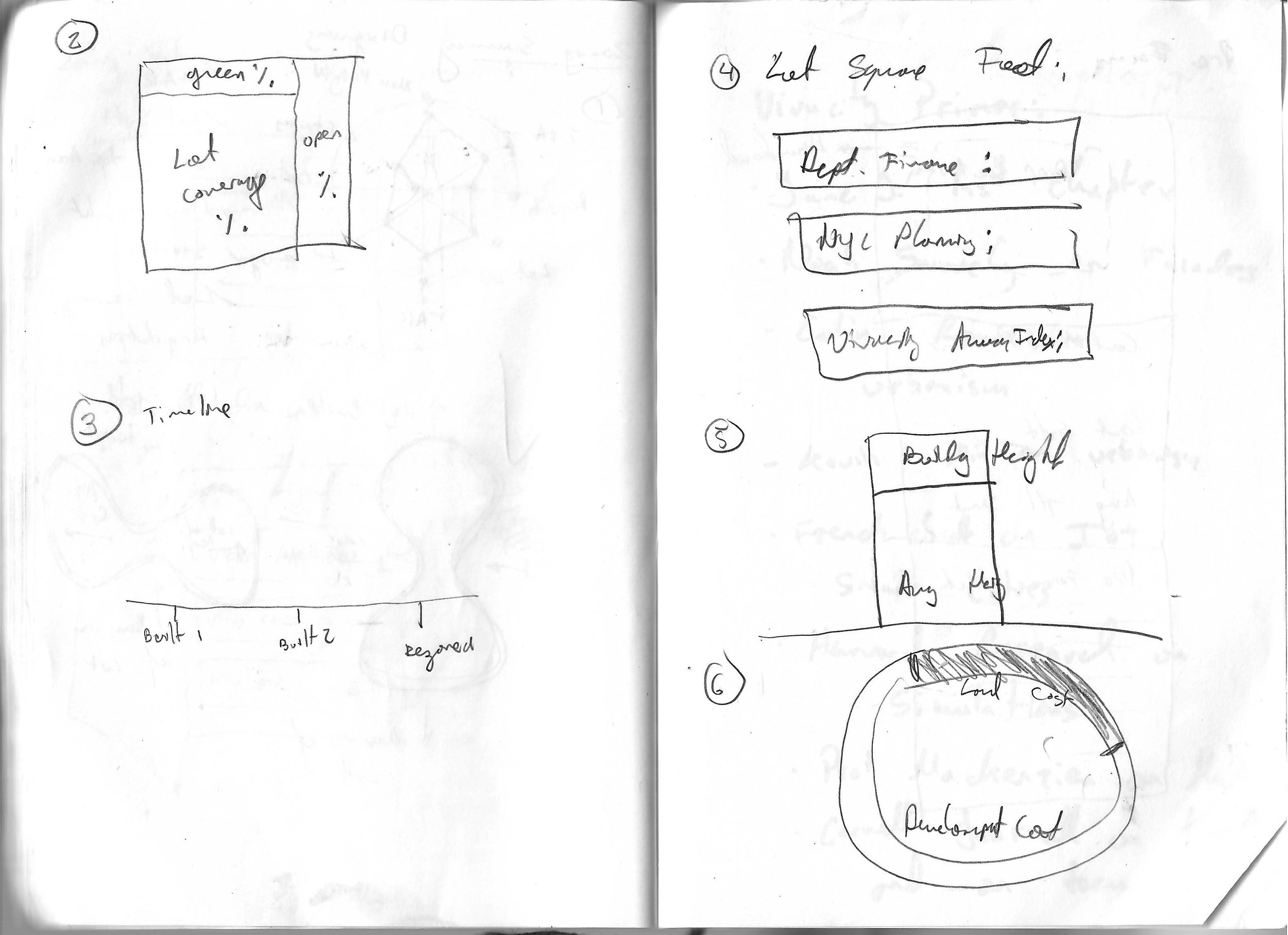
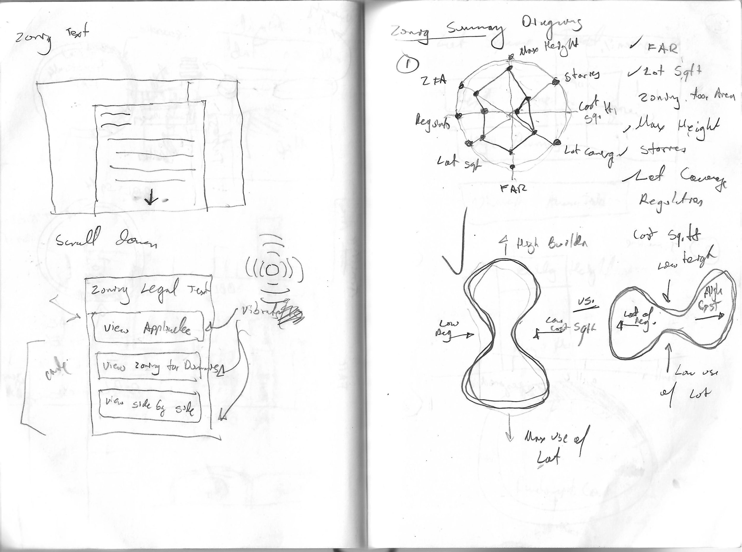
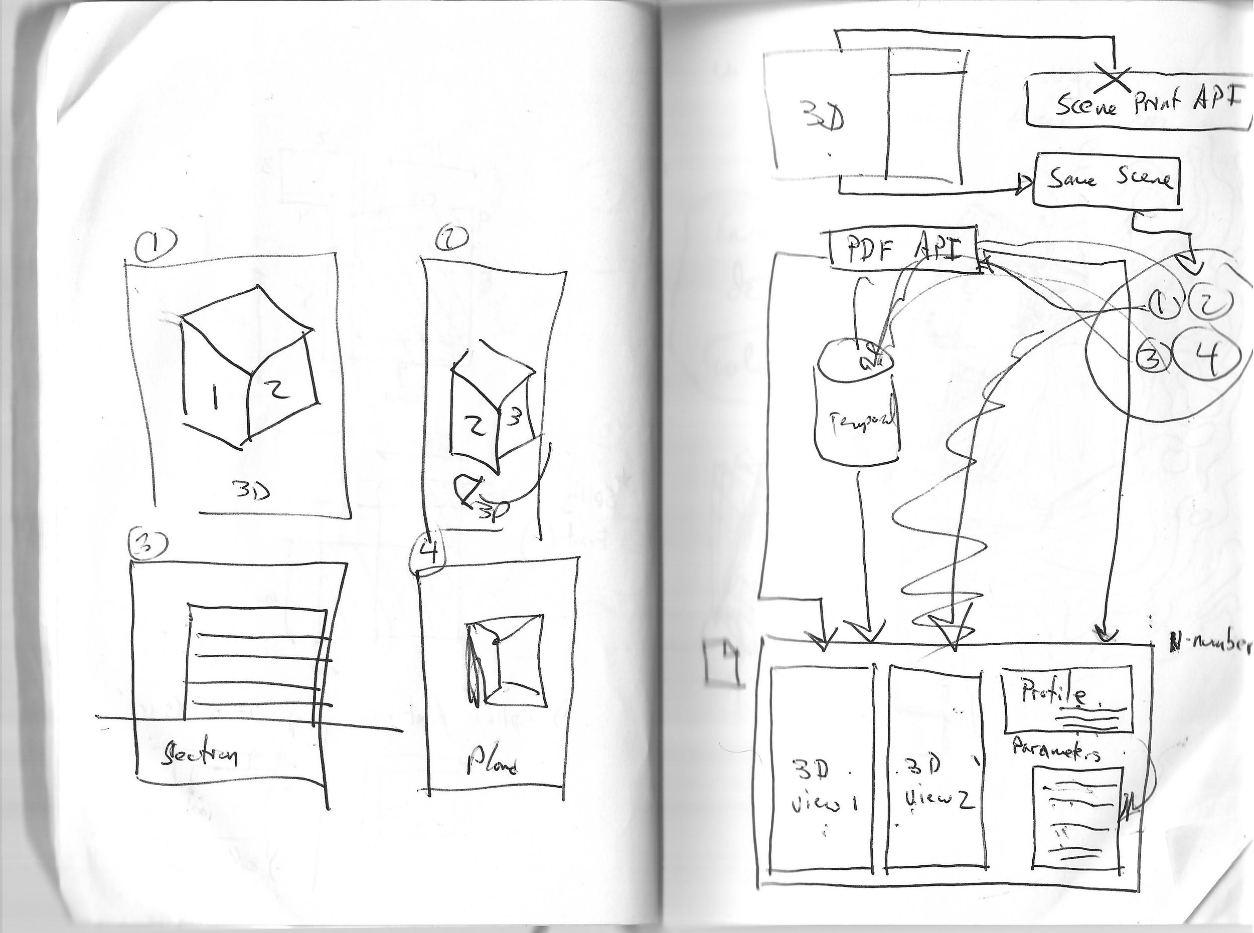
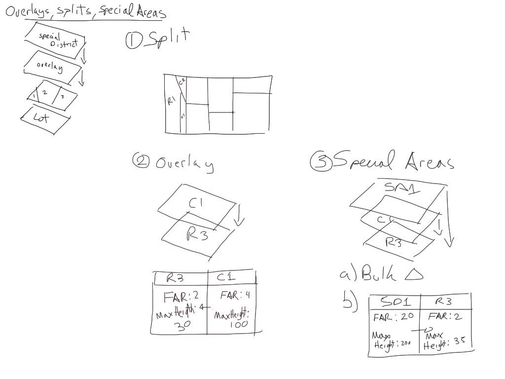
Version Alpha V.0.0
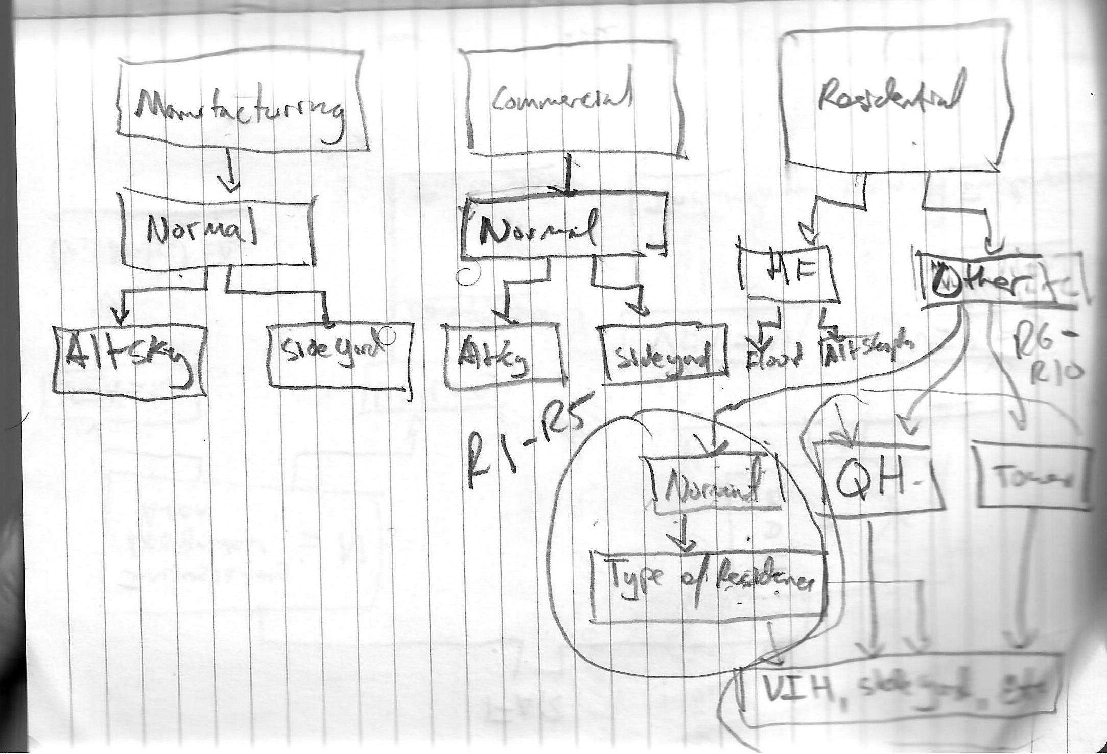
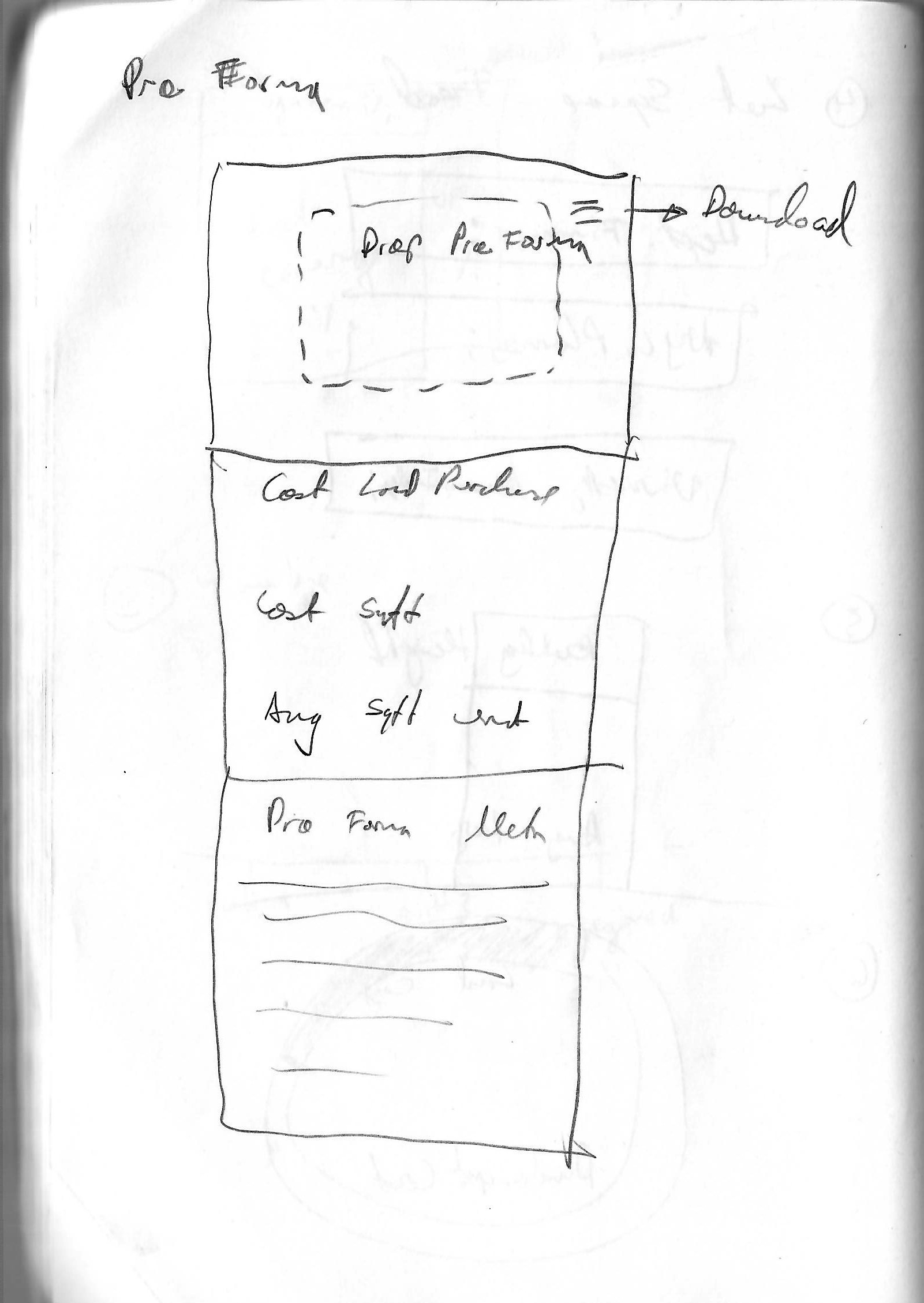
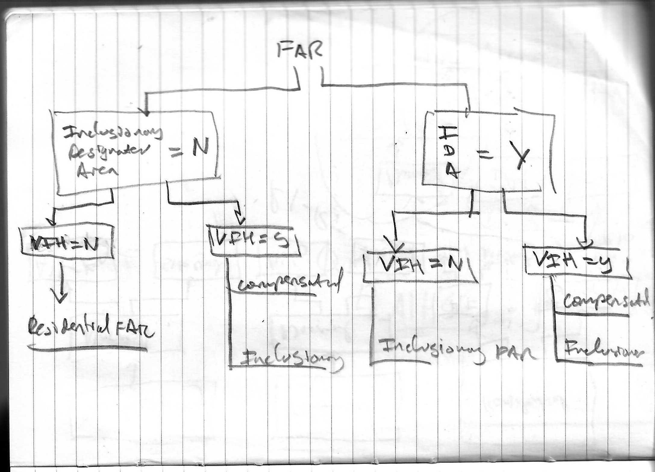
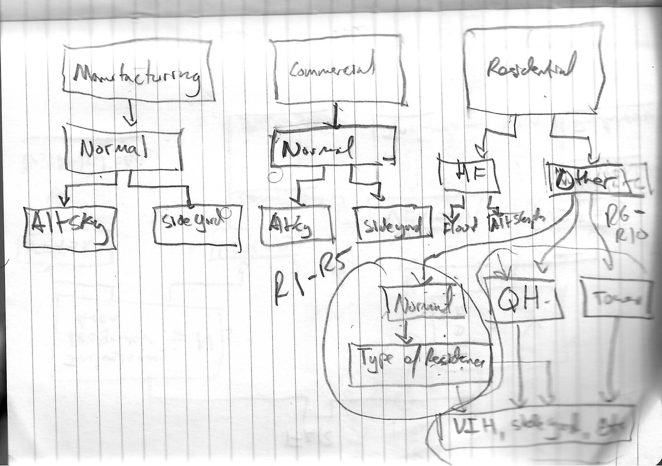
Sketching allowed me to concentrate on capturing quickly and without any compromises, the needs stipulated by the potential users. These early sketches captured the complicated nature of designing a zoning platform for NYC, given all the conditions and exceptions of the legal text.


Version Alpha 1.0
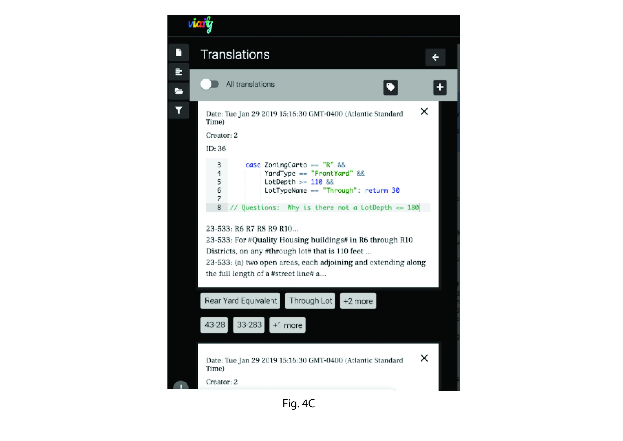
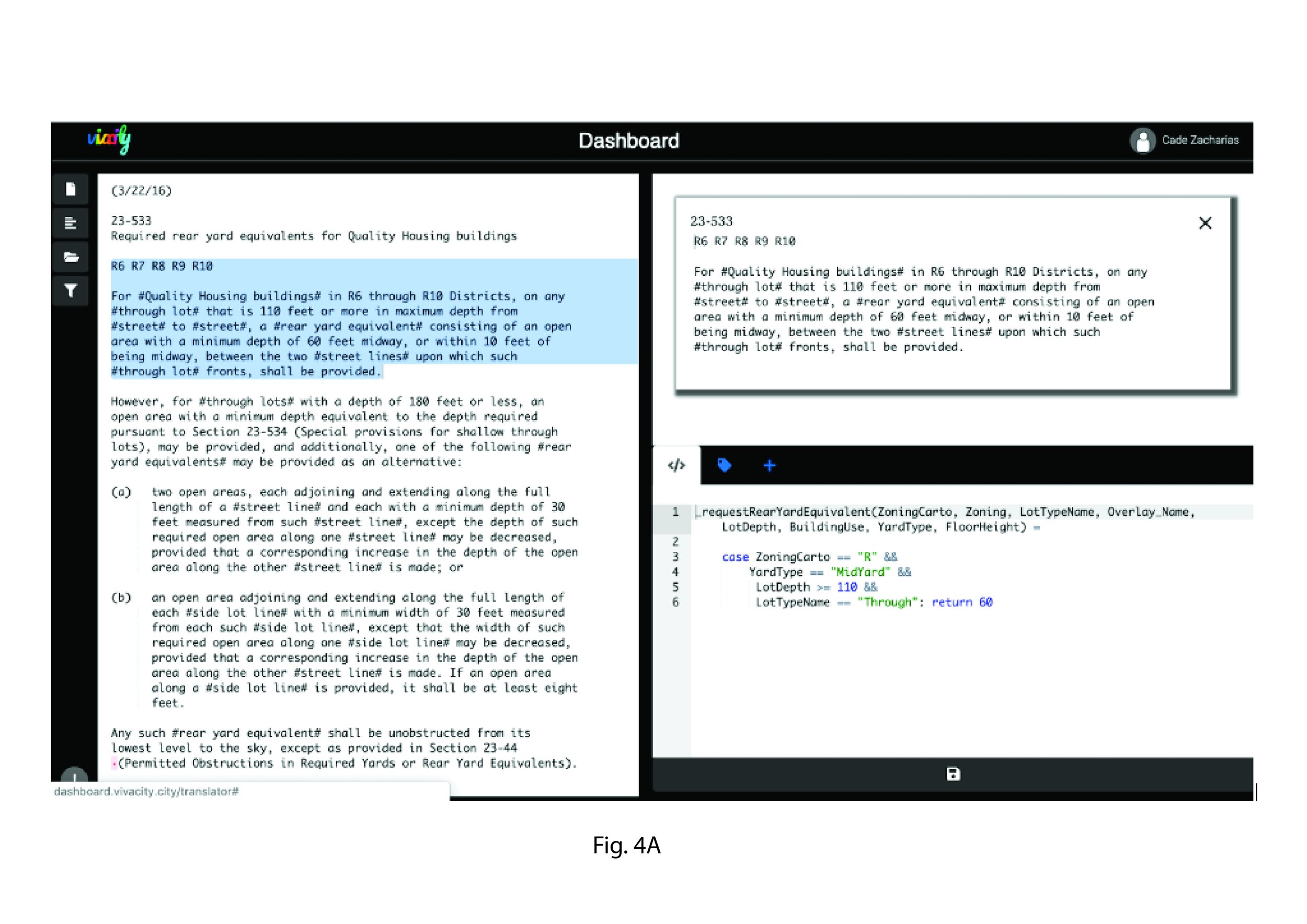
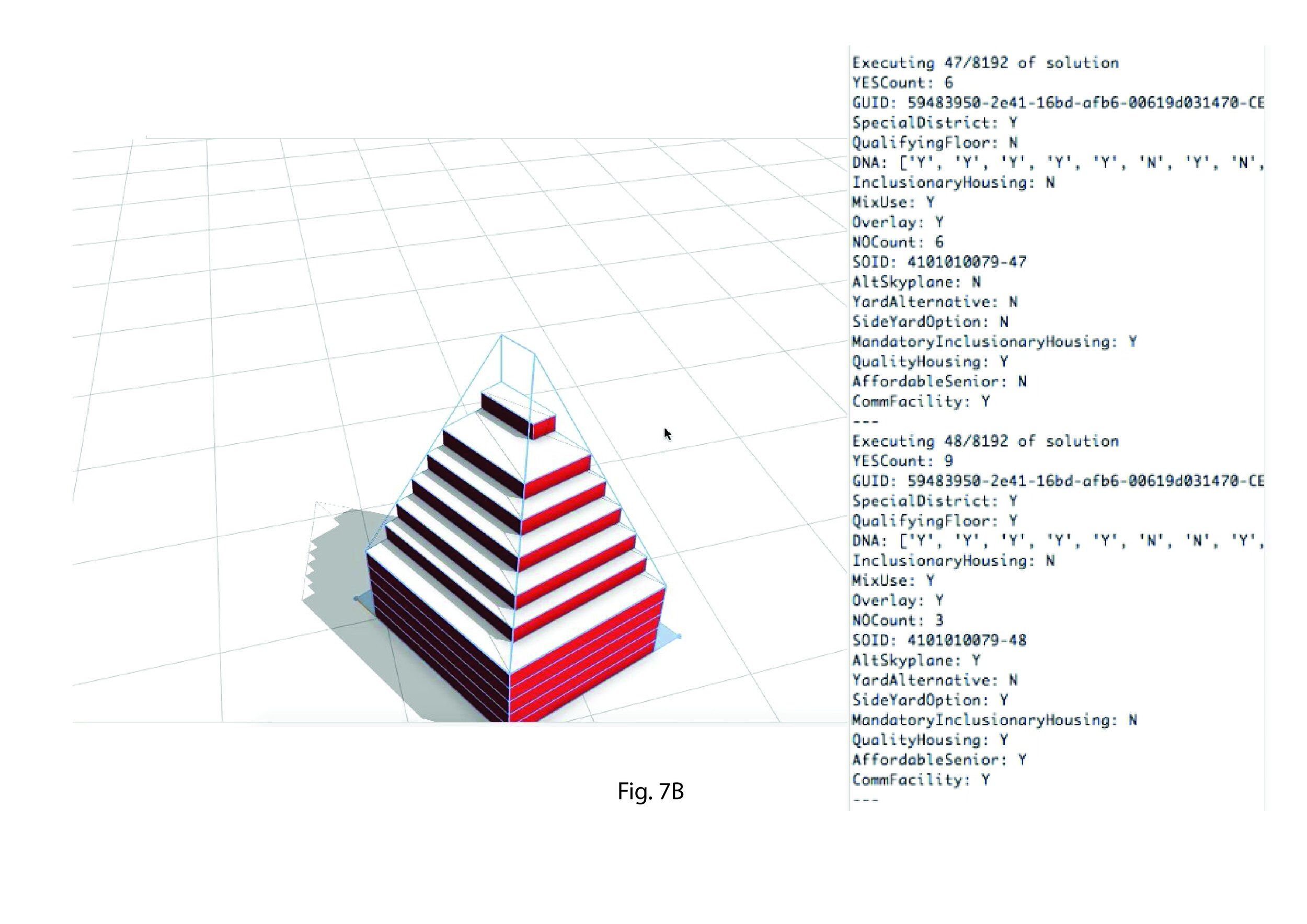
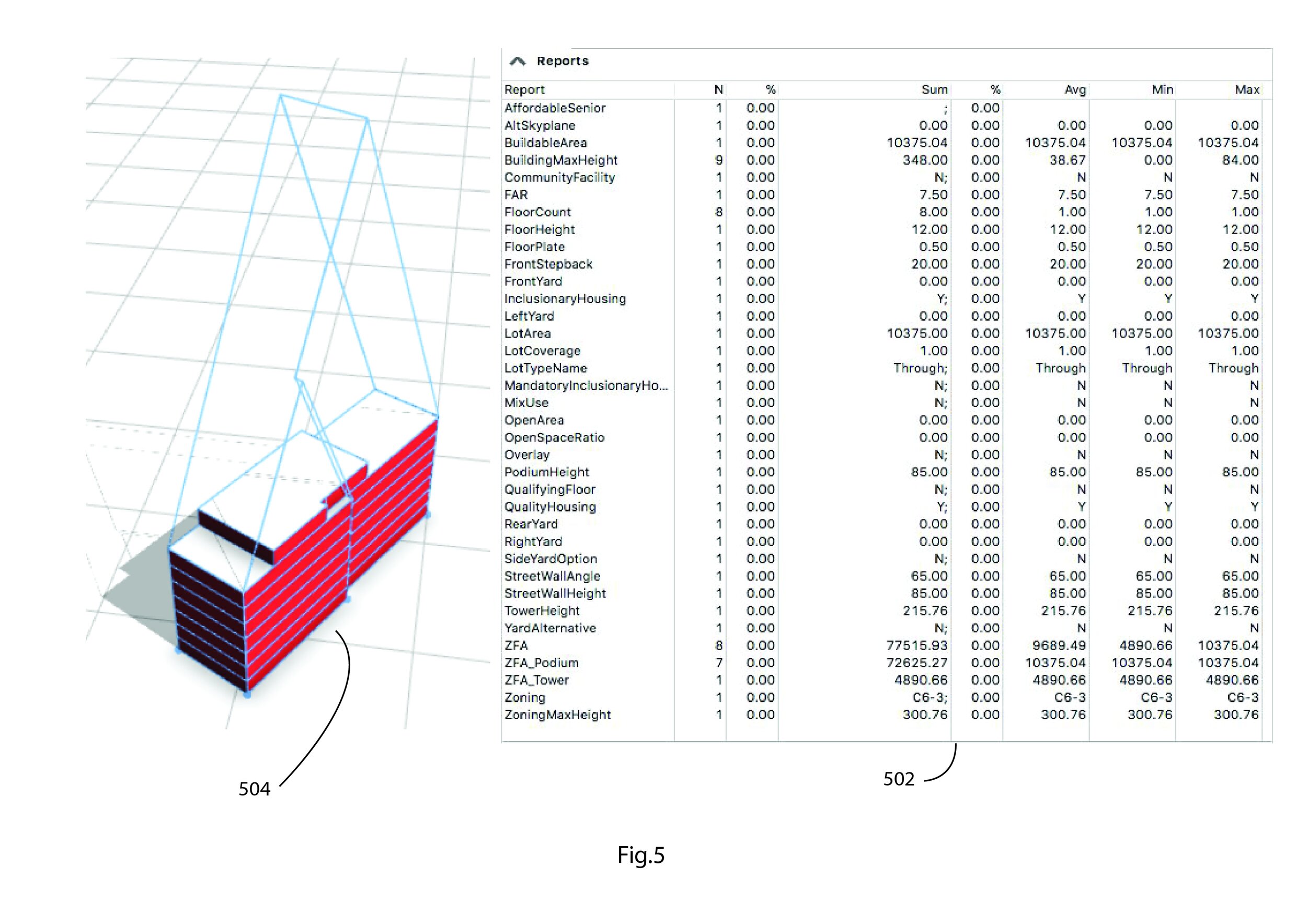
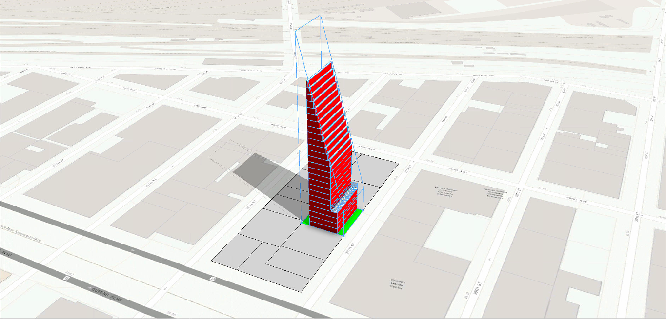
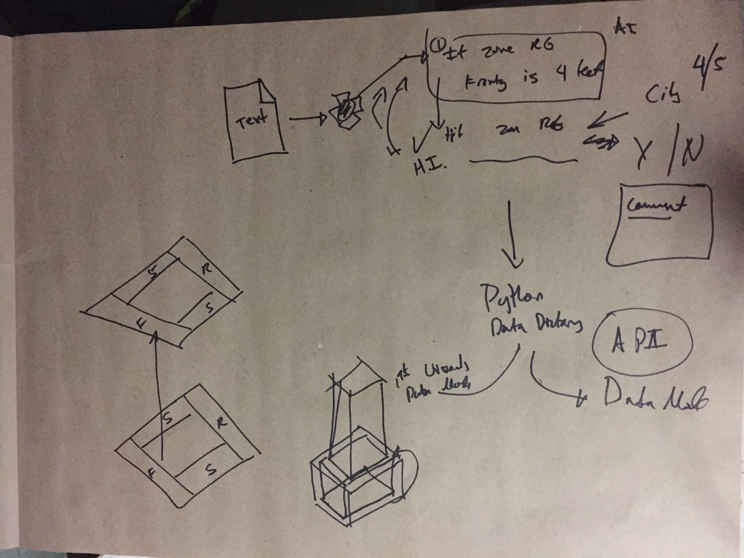
With a rough idea in hand, I delegated the task of creating a zoning text viewer to a junior developer, and I focused on developing RoboJane. I verbally gave the notions to the developer, and he took the liberty of designing something quick using Python’s interface.
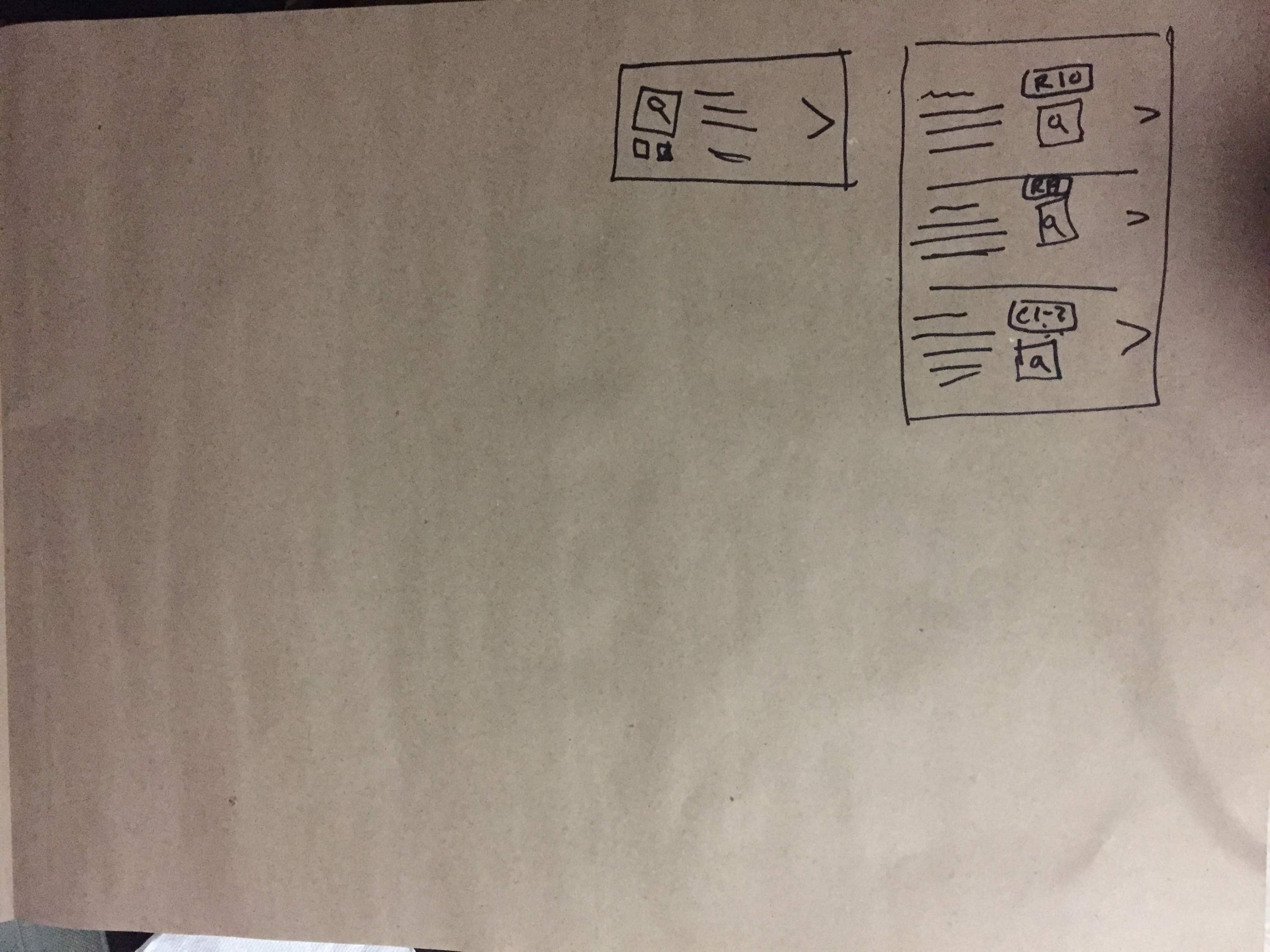
I also wire-framed how the app would be organized as a website.
We showed these early prototypes to Beta users to confirm we were going in the right design direction.







Version Alpha 2.0
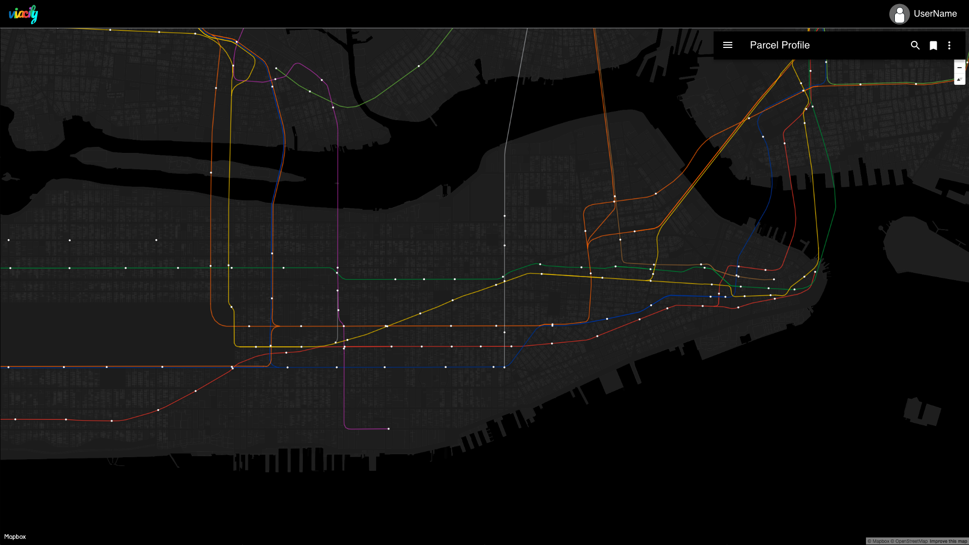
I developed this version in Adobe XD using the data and images from Alpha 1.0.
Users wanted the map to be the main viewing interface and any data-driven information to be presented in list form. After confirming what users wanted to see, I organized tabs as:
existing building and zoning information,
a property’s new zoning potential,
a summary report tab of the potential value of the property,
the raw zoning textual information for the new applicable zoning,
a data visualization tab.
I designed a simple on-boarding to decide which tab should be prioritized as your Home View depending on your user persona.
We tested this design with a group of 5 people who expressed interest in the product. Their feedback was crucial for refining the on-boarding experience and rethinking how to better organize the information we were displaying inside the tabs. The map with 3D visualization of the existing buildings and potential zoning was validated and survived the next round of design iterations.


Version Beta 1.0
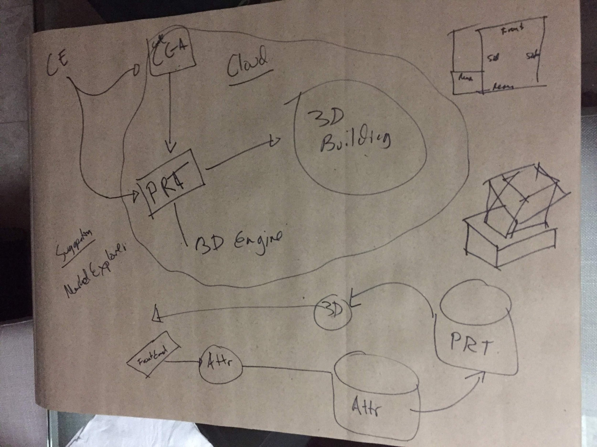
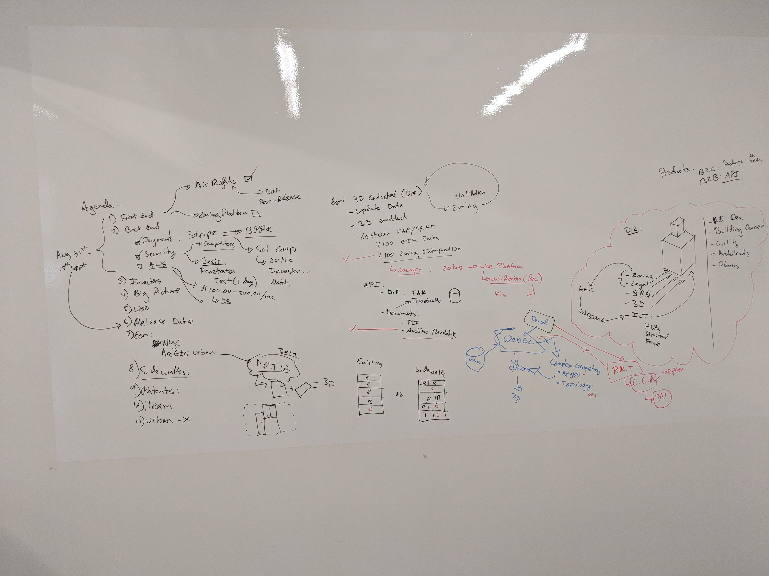
After showing the high-definition mock-up to users and receiving feedback, we went back to the drawing board to flesh out all of their feedback. Users wanted information to be organized hierarchically per zoning. They also wanted the freedom to explore the 3D geometry of the zoning lot. I decided to sketch these changes out so we could have an internal agreement before we wrote any code. Changes to the code base can be expensive after the fact. Addressing user feedback through light iteration via sketches often provides clarity on how to reorganize the system.






Production v.1.0
We selected a small group of users who had pre-registered for our platform to test our alpha version.
The main transaction of the app, viewing existing building zoning information, was validated.
Users provided useful feedback that helped us improve the product:
Users expressed that the array of information could be better grouped and organized.
Users asked if further contextual zoning information could be provided on the map.
Users asked if we could do a Light Mode Version.
Users asked if there was a way to port the information offline, like a PDF.
Users asked if we could provide a better way to share the information on the platform via a links.
Users asked if the financial modeling could be further elaborated to align with real estate proformas.
Users asked about the possibility of downloading the financial models as Excel files.
Property Portal - Production v.1.0
Production v1.1
Version 1.1 introduced a series of new components that better organized the options users had to reveal more information. This included the creation of a menu to style the basemap, a menu to navigate to bookmarks, a share link button, and a user settings button with a Dark/Light Mode toggle. The new version also improved the user experience observed in v1.0. New features requested by the beta users were also added.
Dark Mode | Light Mode
One of the most visible changes to the platform was the introduction of a Light Mode version. We had two reasons to implement this UI change: 1) User’s requested a light version, 2) When producing portable PDF documents, it is better to use light colors to not overload the PDF in case the user wants to print the document. While producing PDFs was not enabled, we still implemented the changes by pushing regular updates.
I revised the color palette for tags, buttons, and data-driven charts to make sure it matched the light mode version. We also created a new light mode basemap to ensure a consistent experience.
Production V1.2
Version 1.2 of the app added two main features to the app:
1) An on-boarding experience guiding users on how to use the app and
2) the ability for users to print PDF reports.
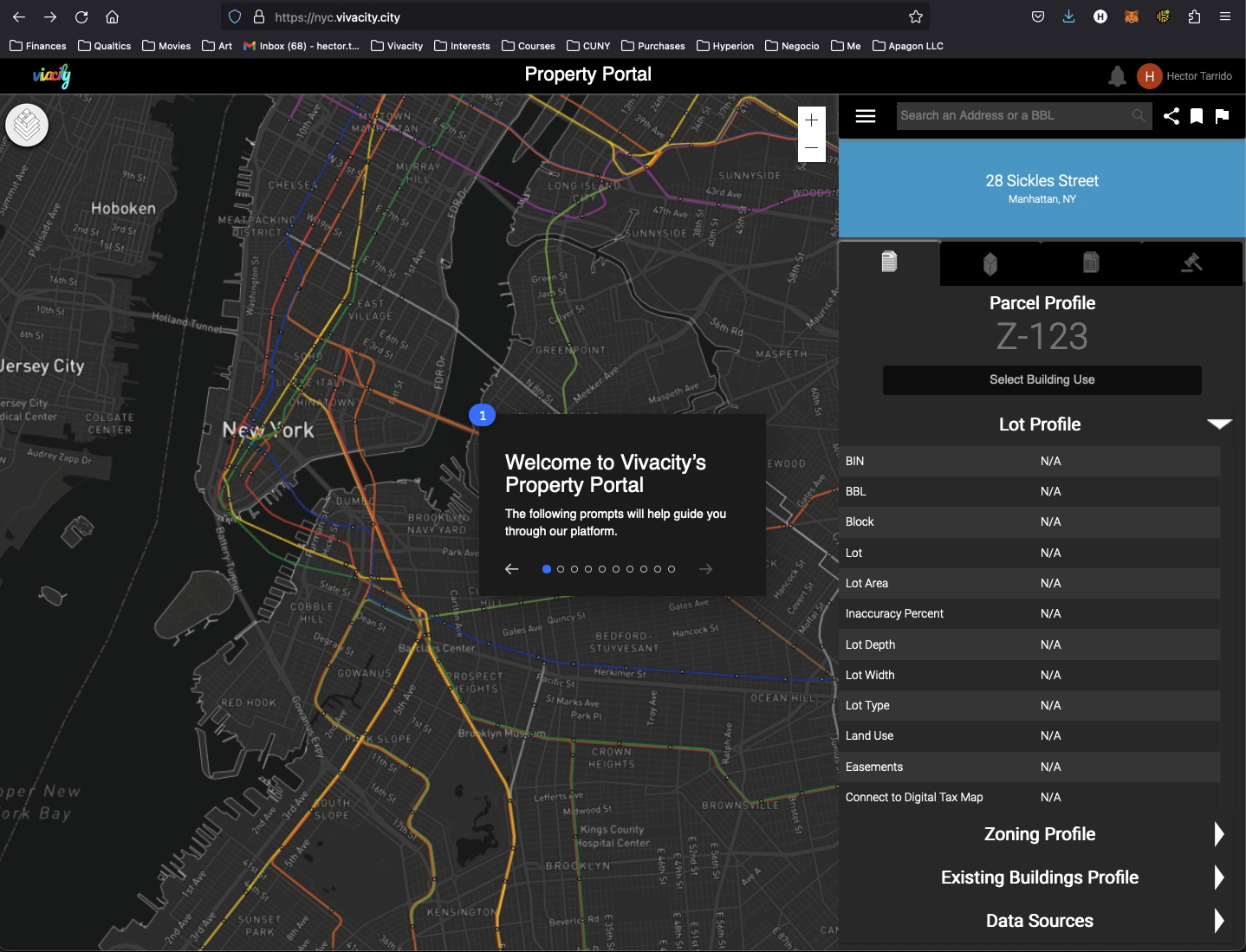
Before developing both features, we interviewed a small number of users that requested the features to better understand their requests. I designed the on-boarding experience to follow along with strong visual feedback. The on-boarding guide only showed up on a per-feature basis, with the principal on-boarding showing up once after user’s signed up to the platform.
The PDF report was designed to follow industry standards. We used the NYC Zoning Amendment Document as a guideline and designed our Zoning Report PDF to align with it’s design. The building violations report was designed based on feedback user’s gave us about the competitors' reports. They wanted to have a document that was organized visually per violation category. We used the concept of cards and tags to help organize the dense information coming from the NYC - Department of Buildings API.
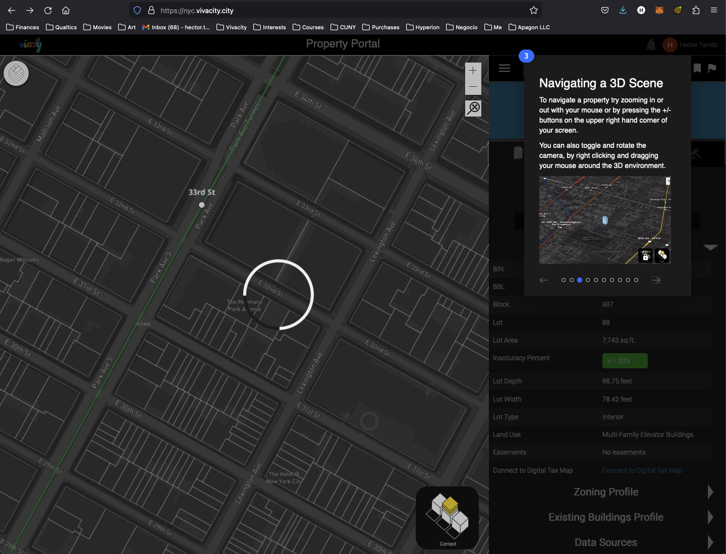
One of the features users most requested was the ability to download a zoning report. Delivering a solution proved challenging since it involved automating moving the camera around the scene, switching scene content, and formatting the report to the users' expected template.
Users also requested a similar feature for building violations.
Production App
Summary
Property Portal was the first app I developed on my own. It was a transformative learning experience. It was my first time using Adobe XD and interacting with junior developers on my own. I also had to negotiate with my fellow founders about the design ideas I had in mind. Ultimately, we learned that the best way to resolve design problems is to put them in front of a user. This lesson took us too long, in my opinion, to learn, but it was the most valuable one for developing products from design all the way to production.
Lessons:
It is better to think of the design of the app and its features in iterations. Only 25% of the original design made it to the final product in production. Keeping the design iterations light and sketchy can help save time and headaches as the project and product evolve.
Always listen to user feedback. They will hold the key to developing new features that will make them stay using the product.
I played the double role of being the Designer and the Back End content creator. I was also involved in some of the Front End development. I got a window into being a Full Stack Developer, and I would not recommend it as a method of developing quality products. It is better to have focused people that have full domain knowledge and have them focus on each task separately than having a team of developers that can supposedly develop everything. When it comes to launching something to production, these details matter. I learned this lesson too late but managed to see the benefits of hiring a Front End and a Back End developer to whom I could delegate implementation tasks for the design.


